Sit Conmigo: The Responsive Web Design Case Study
Scope
The impressive Yolanda Lopez and her ethical, sustainable chair company, Sit Conmigo, needed a website design to feature her new chair designs, and grant customers the chance to start pre-ordering them. And since her shoppers usually use their smartphones to do just about everything, Yolanda wanted her site to be mobile-ready.
The final deliverables consist of design comps in mobile, tablet and desktop versions using Adobe XD, a color scheme and a typescale inspired by the Sit Conmigo logo and mission, as well as exported assets for Yolanda’s developer.
Role
I closely worked with Sit Conmigo’s owner as the project’s designer to fully grasp the company’s goals for their site and incorporate them into a refined final design.
Problem
It is no question that the Sit Conmigo creations are stunning, artisan-made and ethically built. They got the goods, now they need a virtual space where buyers can access their chairs beyond their studio.
Apart from a commanding design, the Sit Conmigo website needed to encourage their customers to pre-order the second they arrive at the homepage. It also needed to have specific sections with navigation links that would allow the customers to pre-order the chairs, learn about Yolanda and her team and their amazing mission, and finally, get in touch with the company.
Goals
Ultimately, pre-orders would allow Sit Conmigo to focus their production on in-demand items and make a higher profit because they won't be spending money on wasted materials. With the website design, we aim to introduce customers to the brand, highlighting their business values and mission as a fair trade and labor company.
With these in mind, I designed a single-page website with sections for Pre-Order, About, and Contact, complete with navigation links and a large header (CTA).
Design Research
To fully decipher the goals for the site, I had Yolanda fill out a questionnaire, from which it was clear that Sit Conmigo’s focus on the sourcing of their materials as well as ethically building their products with fair labor were what set the brand apart from their competition. It was also high on my list to create an engaging mobile layout while focusing on pre-orders.
Wireframe Sketches
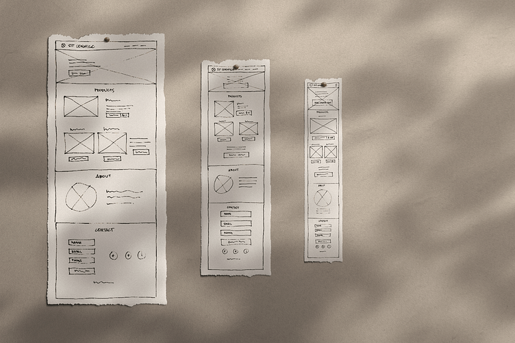
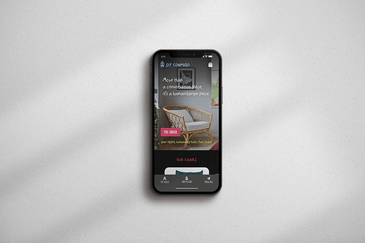
With the goals for the site in mind, I began working on the project by sketching out the mobile wireframe. I included a large call to action as the main focus on the homepage to get customers to pre-order. Furthermore, I saw to it that the images of the chairs were sized prominently so that they will draw attention to strategic sections of the layout.
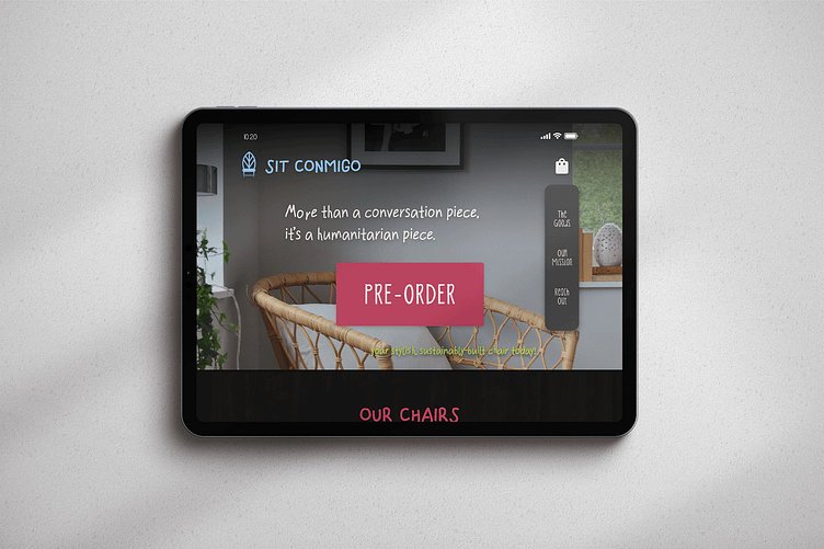
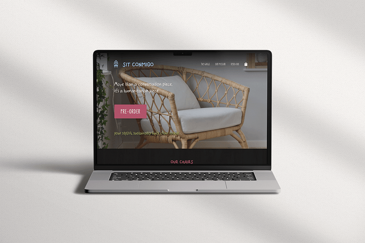
Once done sketching the mobile wireframe, I proceeded with the tablet and desktop wireframe versions to ascertain that the site stayed engaging and balanced on varying devices.
Digital Wireframes
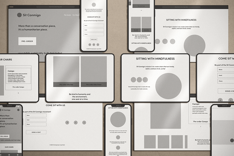
Having completed the site’s layout across devices on paper, I used Adobe XD to turn the sketches digital. It was also during this point that I added Sit Conmigo’s copy to make sure that there was ample space for it, weaving in the company’s mission and quotes throughout the page.
Color Scheme
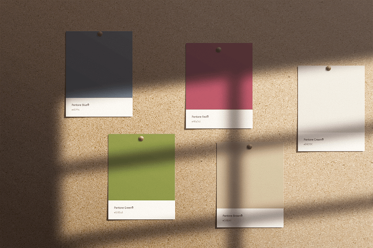
I loved the clean slate in terms of choosing a color scheme and typescale that working with Sit Conmigo offered me. I drew inspiration from the images of the chair designs Sit Conmigo provided, which showed natural wooden legs, bold cushions and modern lines. I wanted the chairs’ colors to pop even more, that’s why I went with a dark theme and sudden bursts of color for the other assets and copy. The palette I chose included slightly muted shades of blue, red and green balanced with a pale brown and an off-white. The blue stood for Sit Conmigo’s competence, the red for the excitement in their offerings, and the green for the brand’s environmental advocacy. The brown in the scheme adds more earthiness and the off-white is the perfect neutral to top it all off.
Typescale
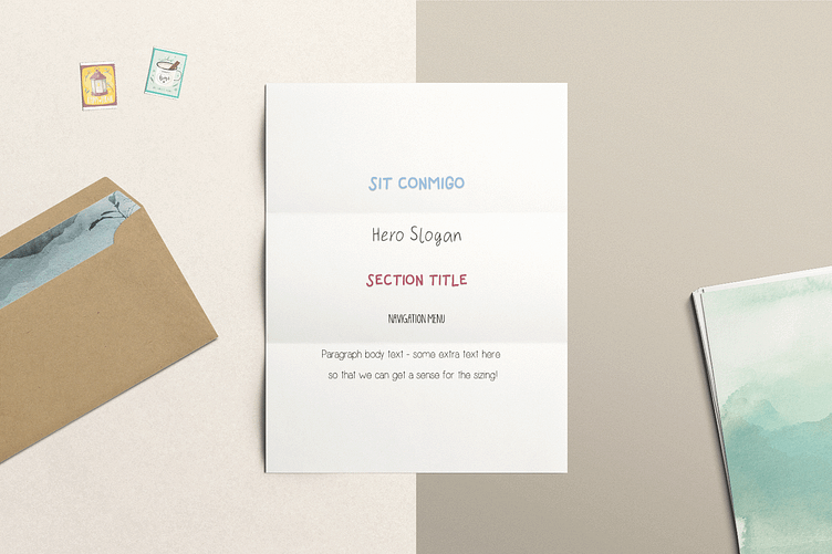
I chose four typefaces that I felt reflected Sit Conmigo’s organic yet modern tone. I selected Simplicity for the body text and taglines, and KG Skinny Latte for the navigation and product names. The Simplicity is a simple and elegant handwritten font that lends a touch of unobtrusive personality, and the KG Skinny Latte is a slightly tall, handwritten unicase that has a bit of a bubbly character while remaining legible and neat. For the hero slogan, I went with the sans serif font Greenfarm with its rustic appeal to show some natural yet delicate prominence. Finally, I brought in the font Finger Paint to complete the typescale set for the page title and section titles. The font began as an experiment with artistic brush effects and then became a real typeface. Ultimately, the whole set supported the organic, grounded tone of Sit Conmigo.
Digital Comps
As the digital comps finally started coming together with the general layouts, the typescale and the color scheme in order, it was time to figure out where the colors went. First off, I brought in a dark wood grain texture as background to the site’s main content to draw the focus toward the images.
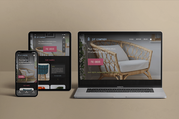
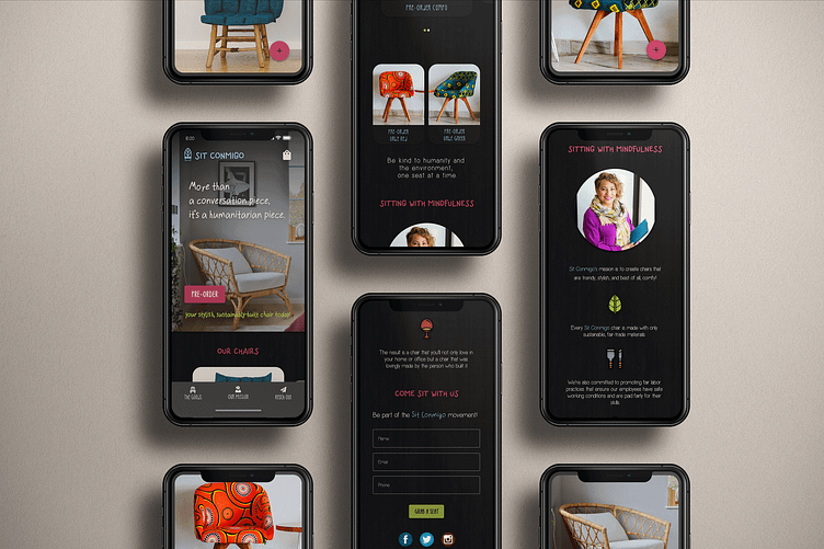
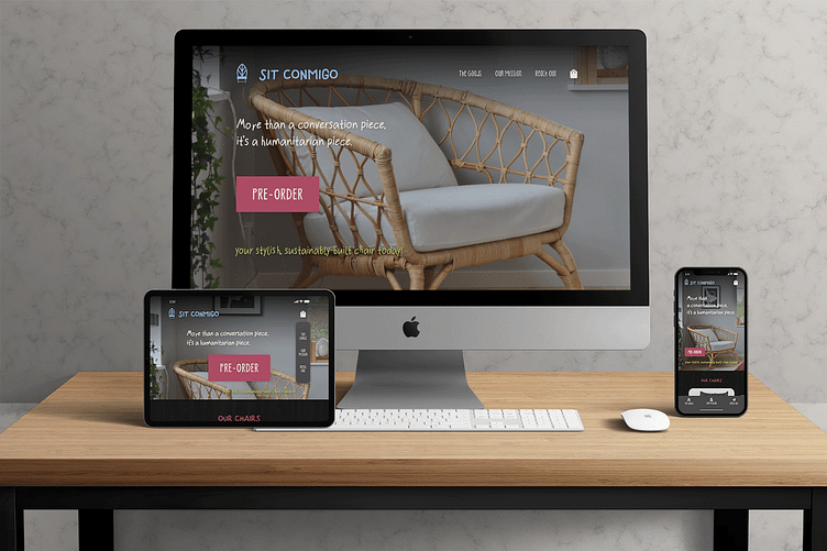
Across all of the versions, the design begins with a large call to action for pre-ordering the chairs with a well-staged image of one of them. The CTA aligns with Sit Conmigo’s goals of promoting pre-orders. In addition, I made sure to place the shopping bag icon at the topmost right of the page.
I also gave the logo and the brand name up top a fixed position so that users can easily tap on them to return to the hero image no matter how far they scroll down the page.
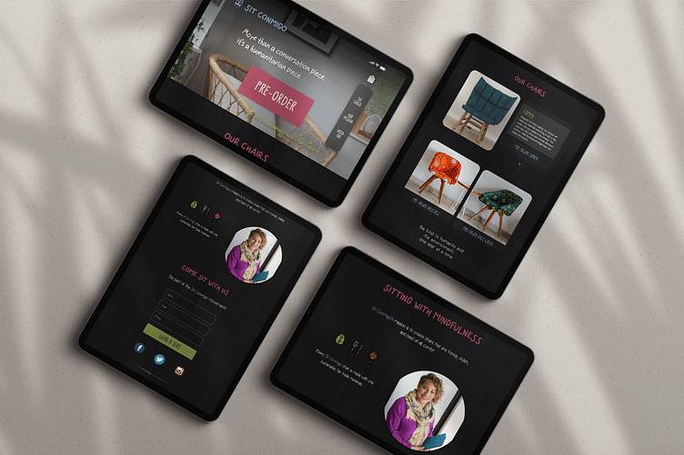
After sorting out the hero image with varied sizing appropriate for each version, I played around with the navigation. For the mobile version, I positioned the nav bar fixed at the bottom of the screen just right above the device’s home tab, complete with icons and section titles. With the tablet version, I decided to position the nav bar fixed vertically on the right side of the hero image and dropped the section icons. In the desktop version, I went with the conventional positioning of the navigation on the top right of the page.
Moving on to the product section, I chose to use rounded corners on each of the images for a softer look. The images certainly stood out against the dark background, bringing the focus toward Yolanda’s designs. I also added an overlay effect with a blurred background for each of the product images so that the users can take a closer look at them as an option.
For mobile, I utilized the drag trigger effect for two of the chair images to make the section interactive but kept the other two images smaller and fixed in position next to each other. In the tablet version, the layout is almost similar. Except that this time, I replaced the drag trigger with the arrow button adjacent to the top image. Above the arrow, I added the product name and description of the adjacent image. The user would be able to tap on the lower pair of images to learn about their product details. Finally working on the desktop version, I added more white space around the product images. And for an unconventional spin, I positioned a horizontal scroll carousel below a large product image and the product title, description and button to pre-order said item. As the user scrolls through the products in the carousel and taps on the images, that product would be displayed in the top image along with its details.
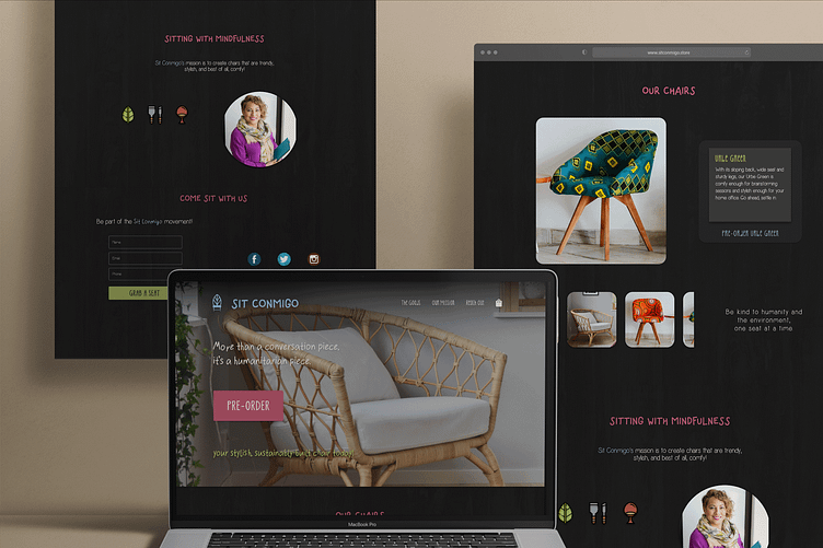
For the Mission section, I made the decision to include a featured image of Yolanda with Sit Conmigo’s mission statement. This lends a human element to the company and sets it apart from competing big box stores. I used micro-interactive icons in between smaller parts of the section in the mobile version, which darken as the user scrolls down the page. In the tablet version, I placed Yolanda’s image right next to the interactive icons which I arranged in a line. Tapping any of the interactive icons would bring up the divided parts of the mission statement. In the desktop version, I switched up the layout of the image and the icons with the copy to play up some variation.
And finally, at the bottom of the page, I included a contact form with interactive input fields and a bright submit button. Below the contact form, I lined up the company’s social icons which also reflected Sit Conmigo’s design theme. This way, it would be convenient for users to connect with Sit Conmigo in a variety of ways about any query or concern.
The tablet version is pretty similar, except for the increase in size and white space. However, with the desktop version, I positioned the contact form and the social icons adjacent to each other. This section is also why I had to switch the Mission section’s element for a sense of balance.
And lastly, I didn’t forget to add the copyright, which has a link to my portfolio.
Responsive Web Design
Working on the Sit Conmigo project using the mobile-first approach, I realized Yolanda's goals and requirements with a design that is fluid like water. With this approach, I prioritized Sit Conmigo's content to give users the most important information they're looking for immediately.
The next step I took was maximizing space given that screen real estate is limited. I utilized a collapsed menu also sometimes referred to as a “hamburger menu” for the mobile version.
After I finished working on all the design elements, I reviewed my design one final time to make sure they look the way I wanted them to. I also removed any leftover placeholders and labels for my artboards and layers. I then grouped related layers together, marked my assets for export, and finally exported the assets by batch.
The responsive web design will achieve Sit Conmigo's primary goal of getting customers to pre-order their chairs across all screen sizes.
Challenges & Takeaways
What I can take away from this engaging project would be realizing how important research is before getting started with a design phase. Talking to Yolanda and learning about Sit Conmigo’s competitors and admired sites made me understand the company and what sets it above its niche. And this allowed me to craft a custom-tailored and device-friendly website for the company that emphasized their mission and Yolanda as a top-notch designer.
Conclusion
The ultimate product of the whole process was a contemporary and engaging one-page design that showcases Sit Conmigo’s amazing chairs. With smart design decisions, I created a website that evokes a balance of modern aesthetics using the latest trends while remaining grounded. With Yolanda’s goals in mind, I incorporated the company’s mission into strategic parts of the design comp and ascertained that the mobile and tablet user experiences were as compelling as the one in the desktop version.
