Simple Blog Screen
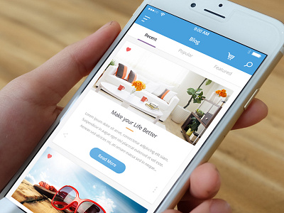
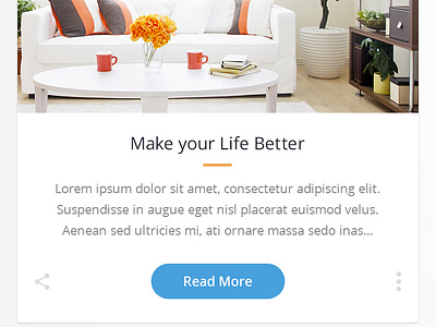
Here is a simple blog screen I created earlier today. I decided to make the posts bigger in order to add more details and have more white areas (making the whole design cleaner). I also added a "menu" icon at the bottom right and a "social" icon at the bottom left.
Don't forget to press "L" to show some love ;)
Bigger preview images attached. Make sure to check them out!
More by Ben Tortorelli View profile
Like


