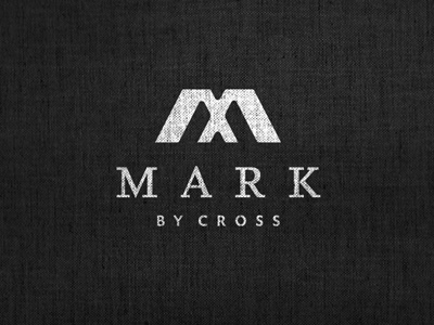
Mark By Cross
Bit of a relook at the format and the typography. Mark is to be the main focus and not the whole 'Mark By Cross' so this means the By Cross sort of becomes the tag line even though Cross is the surname.
Took previous comments to heart and transformed the type choice and layout. This ends up a more traditional layout for sure but with emphasis on the M and Mark.
It's a safe layout but I don't really feel the need to be safe with this one so at a cross roads with the overall layout with text in relation to the symbol.
More by Smitho.graphics℠ — Logo & Icon Design Studio View profile
Like

