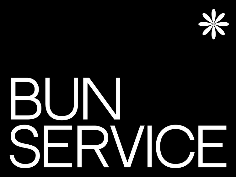
Bun Service*: brand identity for bakery
⬇ Scroll down 🙂
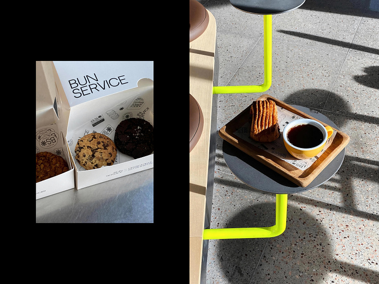
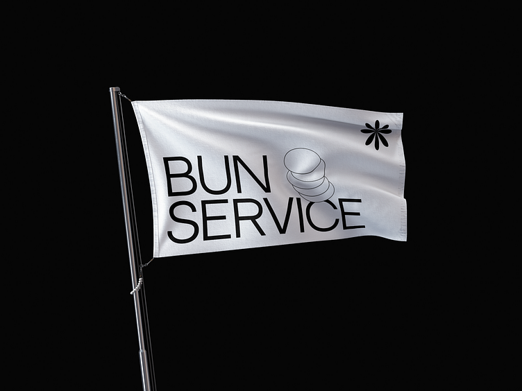
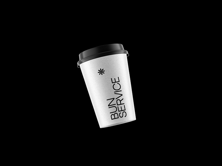
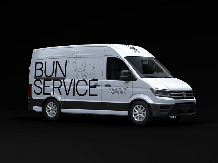
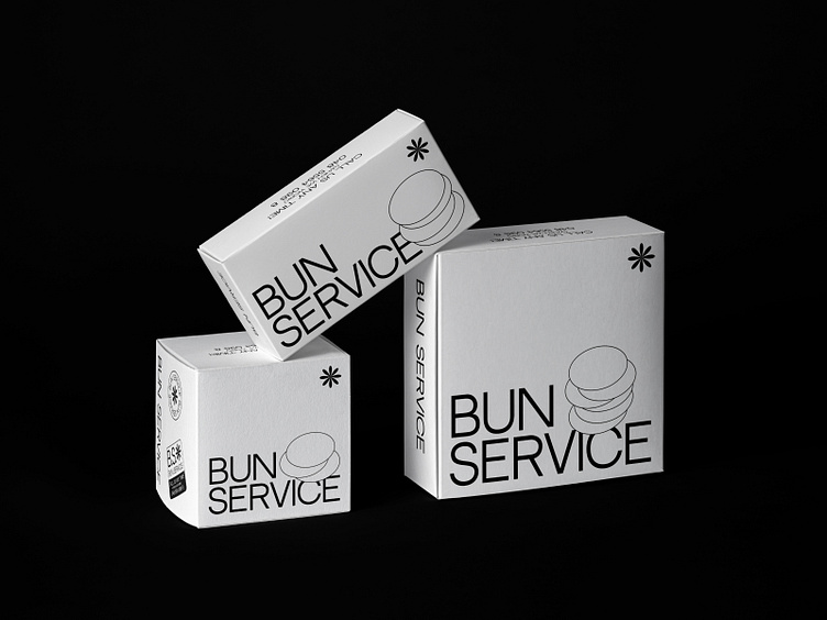
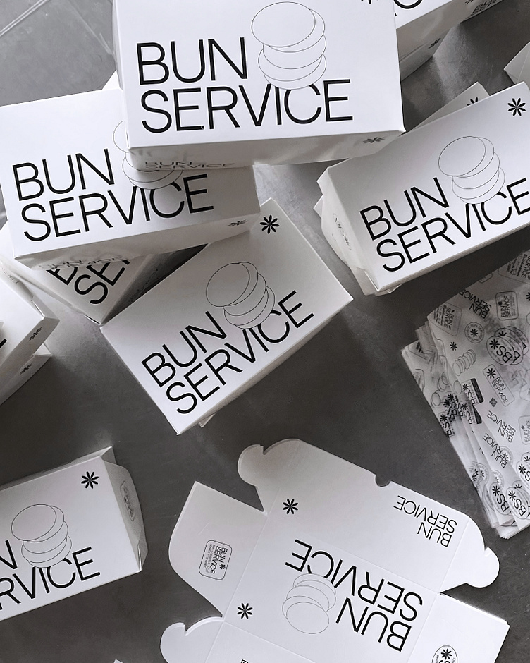
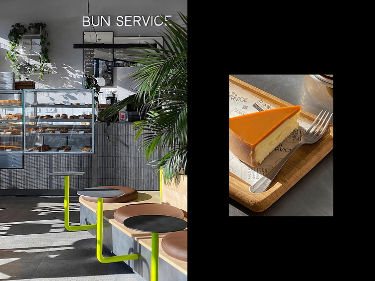
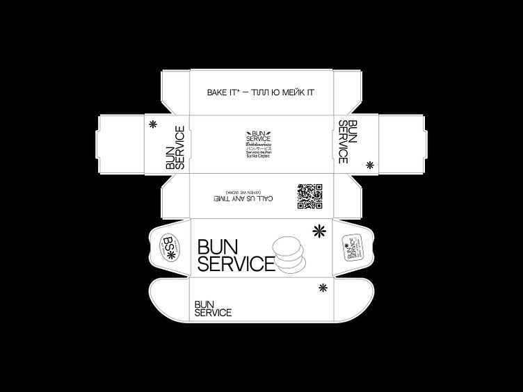
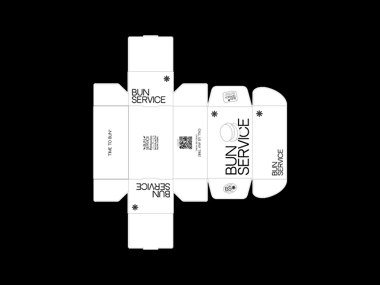
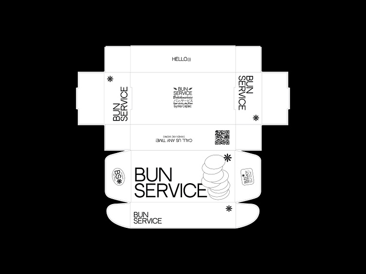
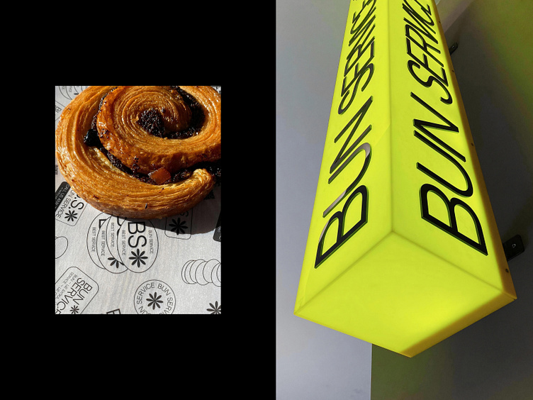
Conception, branding, and naming for the BUN SERVICE* bakery
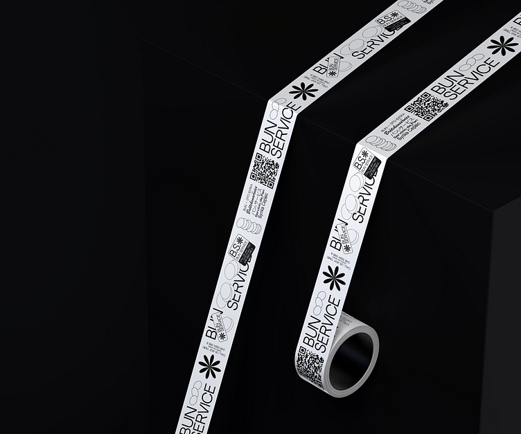
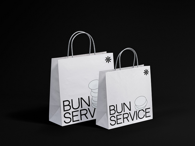
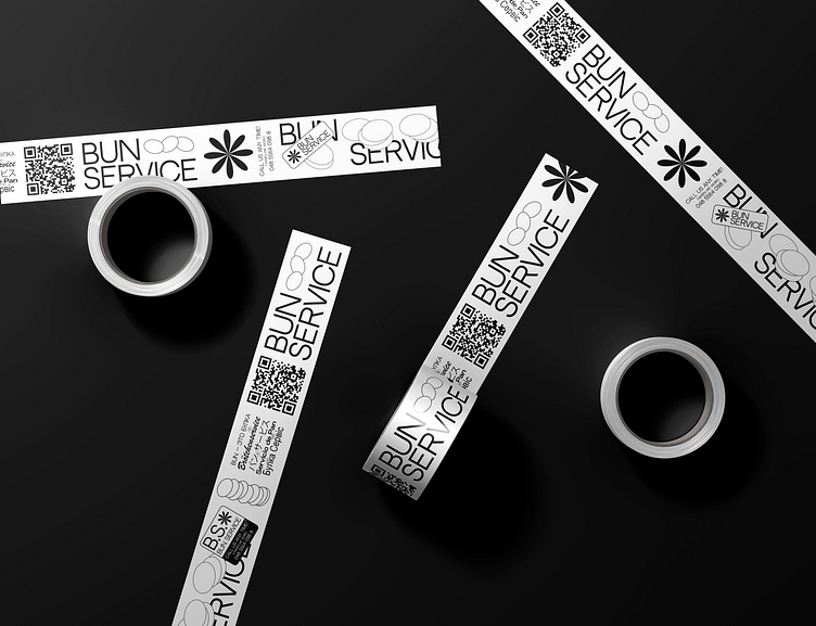
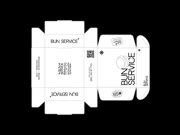
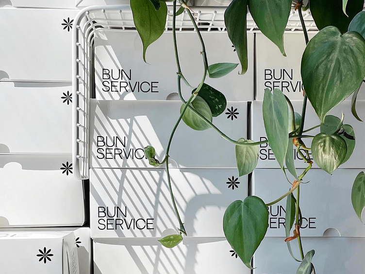
The main task was to optimize for printing, but also to make it look interesting – the solution is maximum asceticism. Black color only for printing, and a bright accent color in the interior to attract attention.
The name is a mockery of bakeries that take themselves too seriously, with lush social network profiles and overloaded design. We went a different way – no design, only notifications, and that tautology, about how cool Bun Service is.
Removing this seriousness makes it easier to deal with communication and branding later on, since this format is not artificial, but an extension of the founders and co.
2021
Fun fact: at our first meeting, when discussing ideas, I couldn't get the association with the Beastie Boys' Intergalactic music video out of my head, that dramatic, naive, and deliberately absurd vibe seemed to me like a real reflection of the future brand. As it turned out later- everything about buns, everyone lives by them, all texts about buns, there is nothing more important than buns for us, thanks Beastie Boys 🥯