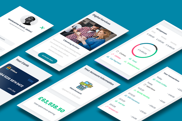
BHBank Banking Mobile Screens Showcase 3
THE IDEA:
Bright Horizons Bank is a fictional client project focused on designing a responsive fresh website. Brand mission is to connect people in a unique way by bringing them closer to things which were not possible before by using the latest AI technology and online banking solutions. Therefore, focusing on young people, while having less focus on older people.
GOALS & OBJECTIVES:
Goal of this project is to attract more young people with great user experience and take them away from the competition, making them stay customers by upselling them attractive tailored services and offers. The objective is to decrease the bounce rate by 40% in the first six months of the site going live, using UX/UI methodologies and techniques for a better, more enjoyable experience.
RESEARCH & AUDIENCE
According to trends, 80% of consumers prefer to do their banking online. Due to the nature of the project, not only is it convenient, but it’s also a significant source for customer retention which is crucial for the objective. Furthermore, 82% of bank customers stay with their banks because of their online and mobile platforms. For these reasons, banks need to make UX a critical part of their digital marketing strategy. For this project, I designed for this target audience: - Age: 18 - 40 - Gender: 40% female, 60% male - Habits: Social media consumption, daily work commute for relatively small companies/freelancing, healthy eating, working out in the afternoon
CONCEPTUALISATION:
In the overall design, I wanted to take advantage of the repetitive layouts & elements to guide the user around the website and subsequently make it less confusing to navigate by familiarising them with certain patterns. A friendly website generates loyal customers and ties into the project's objective above (which is to decrease the bounce rate by 40%).
The user centric repetitive experience mentioned above ties into 4 basic foundations: the navigation, groups & labels, hierarchy and content. This ultimately leads to better key performance indicators such as: less time on tasks, reducing bounce rates, labels that make sense, faster navigation, higher task completion. I have also wanted to write content that makes sense rather than using Lorem Ipsum, as it shows information as it is intended. Visual hierarchy and grids were used for defining the structure of the content and the proper gutters/margins for both desktops and mobile versions.
