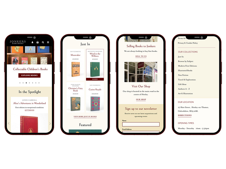
Jonkers Mobile Design
For mobile screens, I shrank the number of columns from 12 to 4 and also decreased the gutter width. I stacked the content and reduced the font sizes and padding. I also decreased the number of books in the spotlight carousel down to only show 1 product.
Final homepage mobile design:
I also created another mobile design for the product page. As the website is an e-commerce site, the product page was the most important page so I felt it needed some consideration and guidance for the developer, Steve.
Final product design:
More by Katherine Cory View profile
Like


