Case Study: Musical Instruments Website
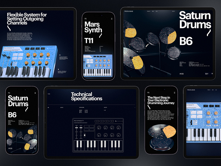
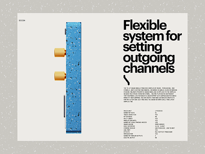
Take a deeper glance at the website design for the company producing and selling different musical instruments: bold typography, deep dark background, prominent 3D graphics, elegant and brutal layouts, and smooth eye-pleasing animation make it informative, atmospheric, and attractive.
• the big collection of our design case studies
• the diverse set of design concepts for business
• the UX practices of product page design
• the guide into the basic elements of a web page
• the tips on how to apply web animation
• the types of interactive content amplifying user engagement
—
Tubik | Tubik Blog | Behance | Instagram | Twitter | Facebook
More by tubik View profile
Like


