Lunar - NFT Marketplace
Lunar is an NFT Marketplace Prototype, that was created in my intro to UI bootcamp class. The Project timeline was divided into 4 weeks of work. The first 2 weeks researching, moodboard and visual exploration. The last 2 weeks finalizing the design, creating a UI Library and a Hi-Fidelity Prototype.
Problem Statement
Client/Audience
The client is Lunar, they are a new up and coming startup with the goal of revolutionizing the NFT marketplace business with a design-first approach and a deeply curated experience for the users.
The audience of this project is all those people that are embracing and following, in a way or another the world of NFT and digital art. We’re talking mainly about tech savvy people that know their way online and in the world of crypto and NFT, with also a strong sense for visual aesthetic and art, they value curated and beautiful experiences as much as they do with the digital art that they create, buy and/or sell.
Challenge
Establish visual language of this new NFT marketplace app that is ready to revolutionize the digital art scene. Lock a visual aesthetic and then scale the design on multiple screens, based on the wireframes and the flow that is provided from the client. Build a UI Library of the final UI and create a functional prototype.
Moodboard/Research


Moodboard 1: Dark Theme
• Darker colors with bright CTAs.
Moodboard 2: Light & Bright Theme
• Lighter colors with pastel CTAs.
• I explored two different options when deciding on color and mood. I chose colors to be appealing to art collectors, something subtle, but not take away the shine or colors away from the NFT/Art. Users need to clearly see the Art, browse and purchase the Art.

Visual Exploration/Visual Designs
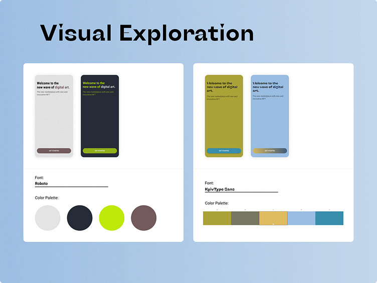
• I had a tough time deciding on a color palette to work with. I used a color palette generator, from the images in the mood board, to create both color palette options. After that, using the contrast checker for readability of the fonts.
• Most of my time I was stuck picking unique colors palettes because the wireframes were provided already.
• For the fonts used. KvivType Sans - modern header font, Roboto for body copy font.
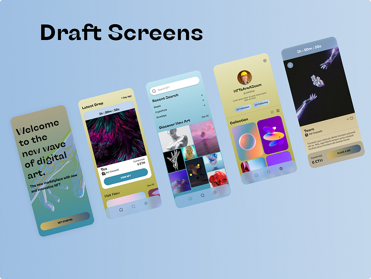
After doing this first draft for the final hi-fidelity prototype. My mentor gave me useful tips on changing my UI buttons, spacing and gave me subtle color changes/recommendations.
Outcome/Results:
• Things to improve upon: Stronger UI elements and more functionality in the prototype.
• Doing another project is repetition for me to understand the product design process again. I am glad to add another portfolio piece and hope to learn more technical/advanced skills to further more my UI/UX design career.
