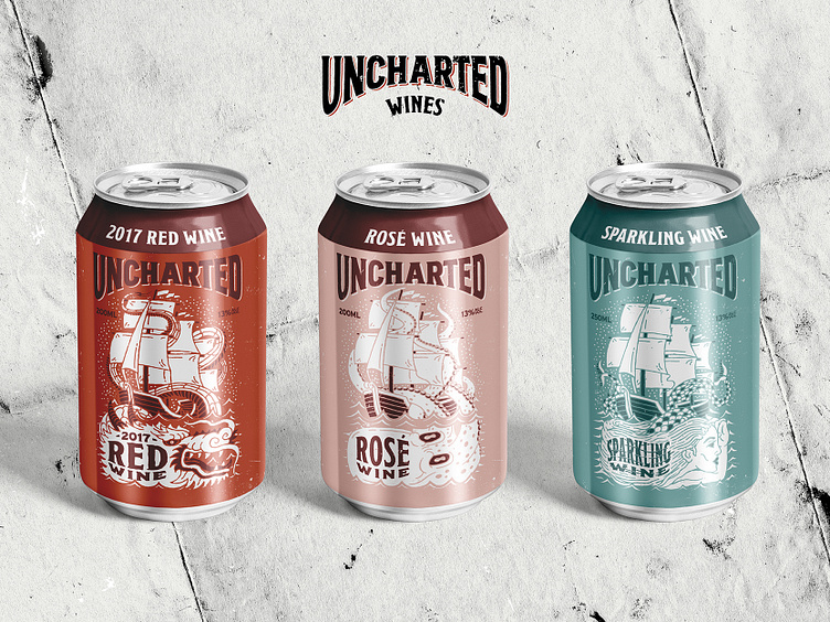
Uncharted Wine - Can Labels
UNCHARTED WINES
THE BRIEF: The aim and direction for Uncharted was to re-package an existing product from a Bottle to a Can in a way that it connected with the younger, craft beverage drinking target audience.
As the name suggests, Uncharted Wines is a product of “uncharted territory” meaning they source the lesser known varietals of grapes that your everyday wine drinker wouldn’t have heard of. To highlight this we looked at the surrounding theme of the brand ‘Here be Dragons’. This theme refers to the ends of the old maps where often dragons were drawn to highlight an “Uncharted” region. Playing off this idea we refreshed the branding with custom lettering and illustration of mythical creatures featured on those old maps and brought these into a more modern sense by pairing them with bright graphics and packaging so to get in touch with the younger, craft beverage drinker.
THE DELIVERABLES: Strategy, Visual Identity, Logo Design, Illustration, Packaging Design.
