Logo designs
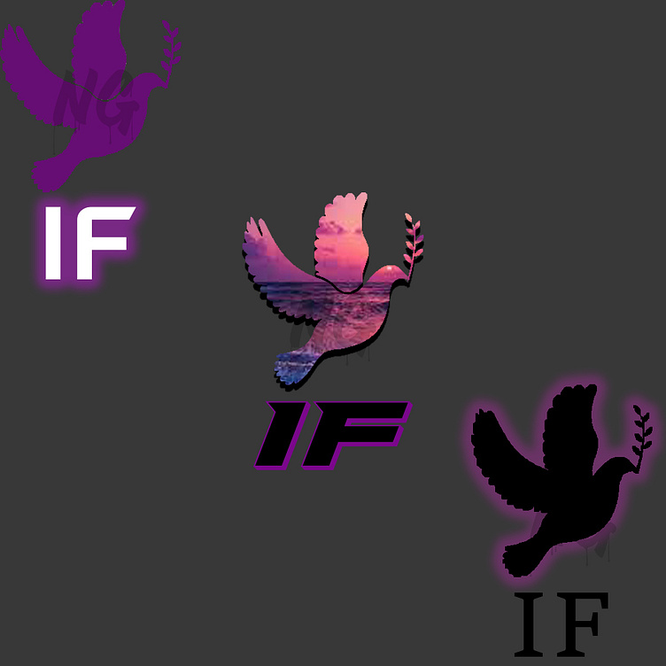
First thing of note is the purple, this was based off the existing website design. Secondly the dove was a major requirement, with the branch in its mouth I believe it plays a role in the mindset of the clients that produces an image of peace and trust. These logos were created for an investment company. So to say the least trust is a huge portion of sales. Lastly the font choices, (far right) I wanted to use a sarif font as the base, this is to be formal, (center) I wanted to make the sarif font a little more "blocky" while at the top keeping that sarif feel, (far left) was going with the same logic as (center) however I wanted to keep the clean cut line as it is more professional and maintaining the fun within. Thank you.