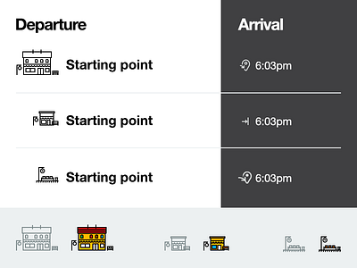
Icon test
Hi all,
Working on personal project. It will be an very easy and simple App for those who are using public train to get to work/home.
Now I'm on a stage of choosing icon style.
In one hand it is about public transport and as we all know usually the whole icons system consist of one color, but on other hand the color icons are so nice :) What do you think?
Also interesting to hear your opinion which icon is better to show departure and destination station.
More by Andrej Melnikov View profile
Like
