Titan Logo Design - T Letter Abstract Logo

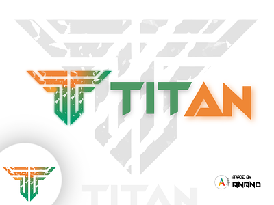
The Logo simply is made up of basic Line Structure for making it look like T with an effect of tore paper and a nice gradient of Indian Color.
The Logo basically intends to Abstract Design but it's a total Copy Flip Design for me 😜 and the blur is just the image itself behind it which makes it look gorgeous 😍...
Share & Support -
╔══ ▓▓ ࿇ - ࿇ ▓▓ ══╗
@Crangsten
╚══ ▓▓ ࿇ - ࿇ ▓▓ ══╝
Contact Us for your Logo Design -