GoPro
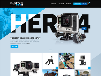
I just simply wanted to design something fun. That wasn't for any particular client, but only for me, to keep me focused. I decided I could pick a cool brand and create something for it. Just for practice, nothing official. I picked GoPro. Not because I don’t like their current website, but because I love the brand and the community aspect behind it.
I wanted to stay away from the typical big image or video header and tried to add something special to it. Something different, but with impact.
Had some great fun designing it. Thank you GoPro for creating the best products and moments with us, and for us!
Full design is attached also on iPad
Ok, back to work.
More by Bart Ebbekink View profile
Like


