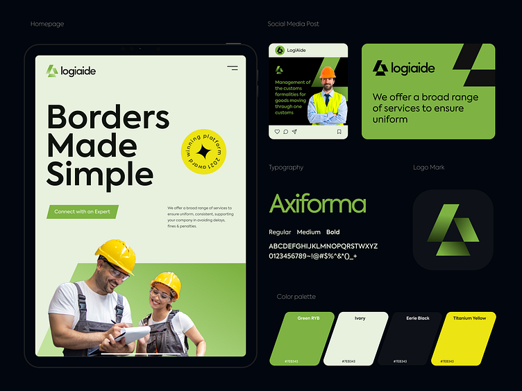
Logiaide-Branding: logo design, visual identity
Hey Guys, 👋
Logiaide offers a broad range of services to ensure uniform, consistent, and compliant trade activities, supporting your company in avoiding delays, fines & penalties.
Logiaide's letters "L" and "A" are used to create the logo, which also has an arrow shape inside. The shape represents a uniform and a community growing together. The green color is used to represent harmony and friendliness. The typeface is used to indicate the modern vibes of the company, with its usage of digital technology and all.
Available for Brand & UI/UX Design
Service and projects
📩 Let’s Chat: aiashik016@gmail.com
📞 Call me: Skype
More by Ashik 🕸 View profile
Services by Ashik 🕸
Like


