Terra Organica
THE IDEA
A unique visual which will represent the brand on various platforms in appropriate variations.
The brand identity was created to fulfil a purpose, and its visual solutions stand for its very essence.
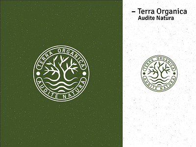
THE LOGO
In strong correlation with nature and harmony with the brand name. Easily adaptable - in print and digital. Visually recognizable and geometrical.
The typography coexists with the visual aspects. Together, these two elements create a perfectly balanced entity.
USAGE
The minimal negative space of all logotypes is based on the dimensions of one-quarter of the total logotype height.
On all sides, the negative space should always be measured from the farthest edge of the visual.
BRANDING
As Terra Organica is an ecology-focused brand, all material should be printed on recycled paper.
