H4 system icons
Found something cute in my work archives. An icons gig I‘ve done back in 2019.
H4—the company that hired me to work on their system icons had a particular problem: How to make the icons fit into our dense product interface, and yet look super-crisp?
My solution was a little unorthodox:
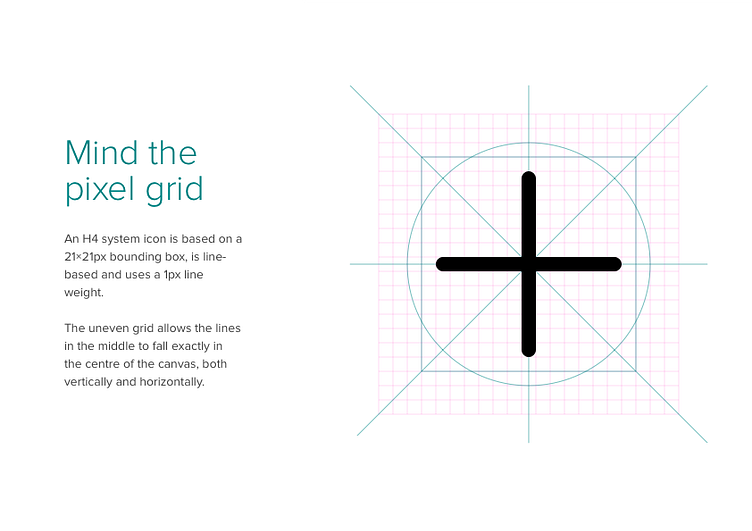
Why don‘t we go with an even pixels grid?
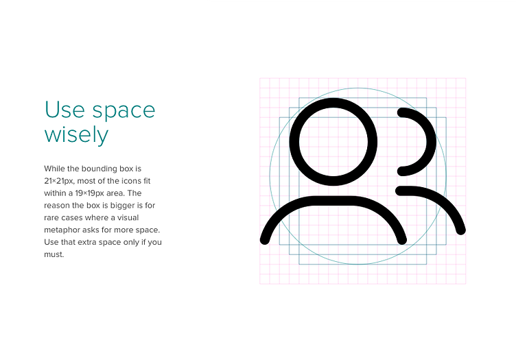
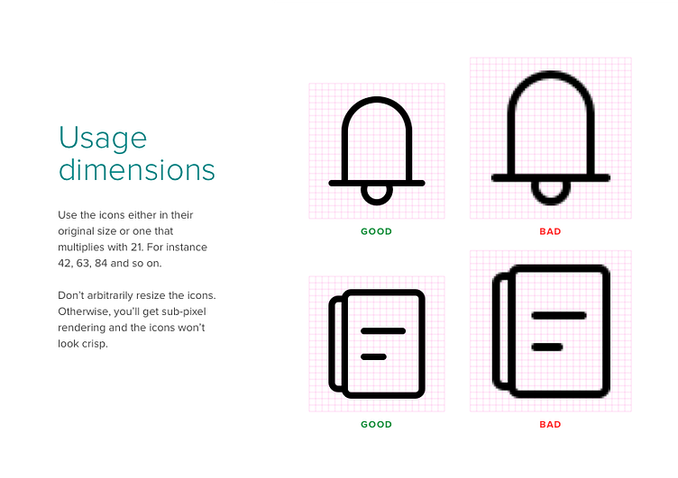
So, I ended up crafting icons on a 19× 19 pixels grid. Why? Because that way I can make sure icons that have a line passing through the middle of the canvas pass right in the middle without being between pixel slots.
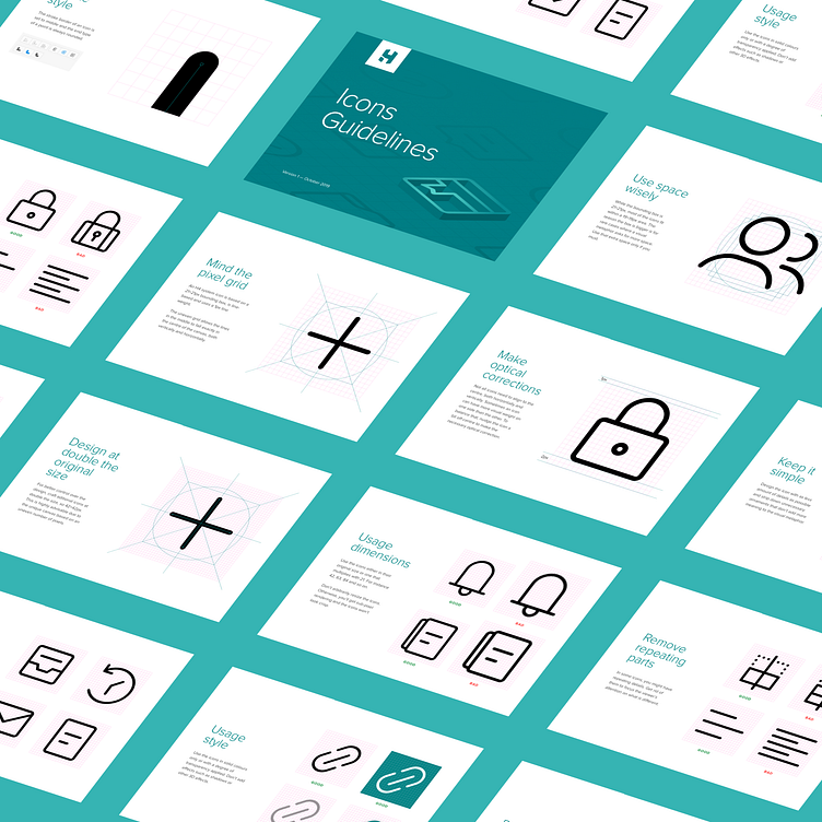
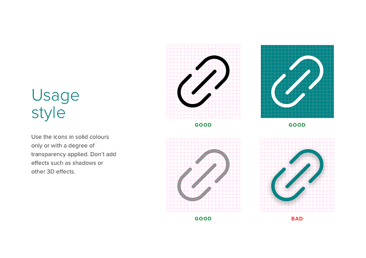
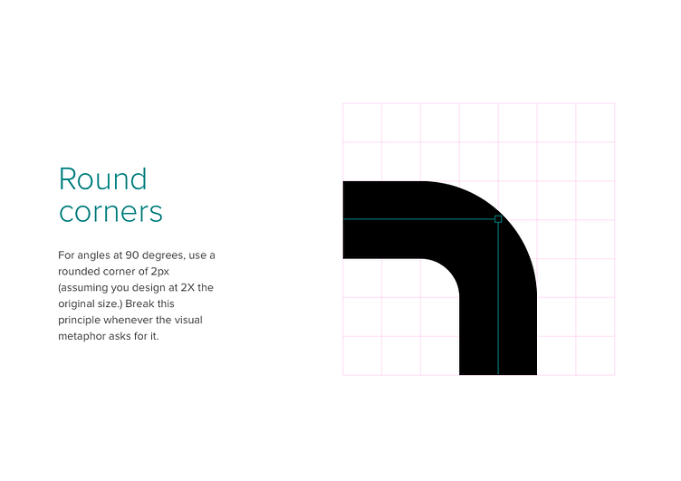
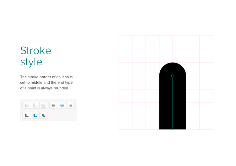
To make sure new employees easily craft new icons in the same style, I mocked up an icons guideline. Because, you know, in case I die. 🤷♂️

Feel free to download the icons guide booklet below.
Icons guidelines.pdf
500 KB