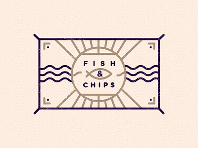
Fish & Chips
So… Right.. Bear with me here.
It's been a very unhealthily yet inspirational week!
Sitting in the fish & Chip shop waiting to get dinner for the family, I was amazed to how outdated the branding, packaging, signage looked.
So I took it beyond myself to mentally visualise how I would like to see the branding… And here's the start of the project.
I have now decided I will pitch the local Fish & Chip shop to see if they want to bring their branding into the 21st Century…
First look is at the identity/signage.
Look forward to your initial feedback…
More by MadeByStudioJQ View profile
Like
