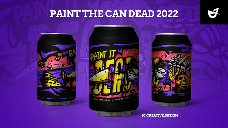
Rogue Can Art
Can art submission for Rogue’s Paint The Can Dead Contest. Wanted to capture the history of Rogue’s beginnings.
From what I understand, Rogue started in Newport, OR at Mo’s storefront. One of the conditions Jack Joyce (Rogue’s founder) agreed to was that they would “feed the fisherman.” This was in my head when I came up with the concept.
I thought it was really awesome that Rogue supported the fisherman and continues to do so today. Also, I’ve been reading The Old Man and The Sea so fishing has been on the mind.
Sketching and Inking
My method of approach was to focus in on each part of the overall design. I started by rough-sketching the concept out, inked it, and added some color to get a general idea of how everything will work together.
The fish and typography were the first two pieces I worked on. I went through a few phases to explore texturing and shading possibilities. This was my approach to every piece of the design. When I was happy with the outcome, I moved to inking on the light board, scanned in each piece, punched the black and white in PS, live traced in Illustrator, and cleaned lines.
Discoveries
There were many things I couldn't see until I was piecing everything together. I haven't decided if this is a process I'm going to commit to fully but I do appreciate the flexibility it offers. Focusing on each area allowed me to move each layer to get the positioning right.
The paint dripping into the sea was an accident. Originally, I was planning on having the paint flow slightly off the brush. As I was moving the anchors around, I noticed that the paint connected nicely with the harbor; dripping into a large body of liquid.
The fishing boat and Mo's storefront came later. One day, I stretched the boundaries and realized that if felt empty. I wanted to add pieces of Rogue's history into the design so I started studying their backstory and looked up pictures of their first location. This inspired the side additions to the design.
Coloring was something I didn't really plan on. As you can see from the first rough concept, I thought of going for a more blue and yellow look. It wasn't until I started messing with colors in the program that I started to make some decisions. Being that the contest falls in October, I wanted to go for a Halloween feel. I started with three swatches and ended with ten. I would've never thought I'd end up using that much color. But the end-result contains so much vibrance and dimension. I'm glad I continued to chip away at each section for that reason.
My Takeaway
A vision is never fully developed and understood until you start putting in the work to create it. Allowing yourself to get lost in the process, for me, has taught me some great truths in the beauty of design. A plan in my design process is a rough idea but never certain. On personal projects and in certain cases, I try not to allow what I know get in the way of finding out what I don't know. That control I've found, when released, is pure freedom as a designer.


