Stamped identity
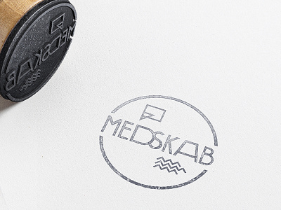
For a long time I've wanted to use a stamp in a identity, but not just to use a stamp. It should have a purpose, it should fit the client and their purpose! And for 'Medskab' it does (yay). Though, this stamp is not the logo, but elements from the identity collected in the stamp.
The logo, the typography here, is a tweaked typeface – now with characteristic letters. More to come on this project.