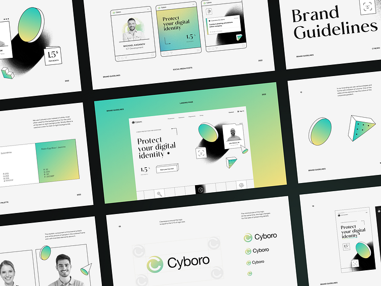
Cyboro Branding & Webflow Case Study
About the project
In this day and age, data has become a valuable commodity and, consequently, a target for many malicious actors. Many entities constantly monitor your online presence, and while tech giants are mostly trustworthy, others might be gathering and selling your information with ill intent. However, protecting yourselves and your customers is possible and necessary. And this is where Cyboro comes in.
The result
For this site, we created an incredibly minimalist, modern, and stylish design. In a way, it resembles a sketch, with its neat thin lines, simple shapes, and greyscale photos. The minimalist approach is further supported by the tried-and-true black-and-white scheme with just a tiny bit of gentle color gradients for emphasis.
Despite all the visual simplicity, it’s a highly dynamic and reactive design: the animated elements make it look like a working mechanism that watches and responds to whatever you do, reinforcing the idea of data protection and cybersecurity.


