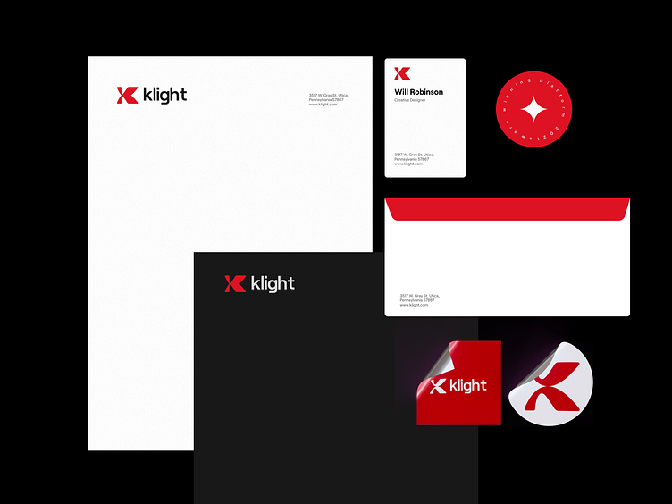
Klight-Branding: logo design, visual identity
Hey Guys 👋🏼
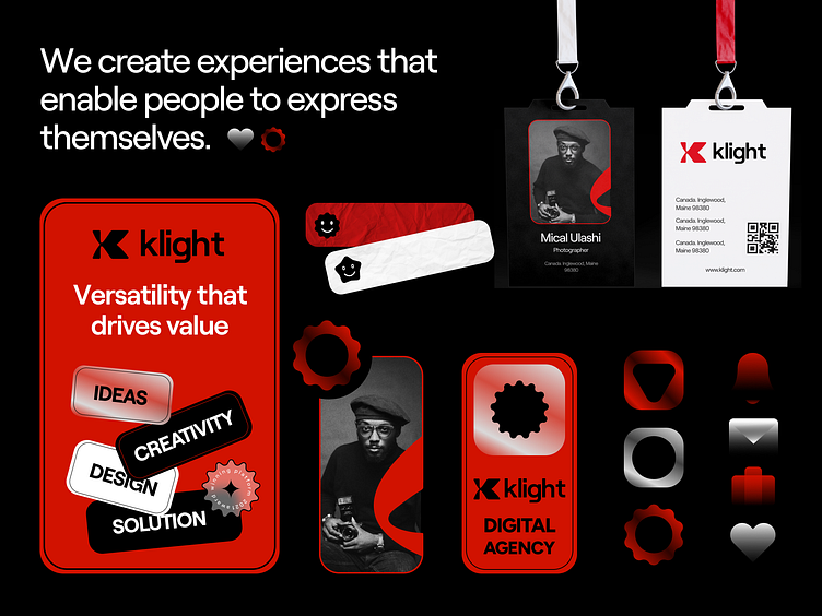
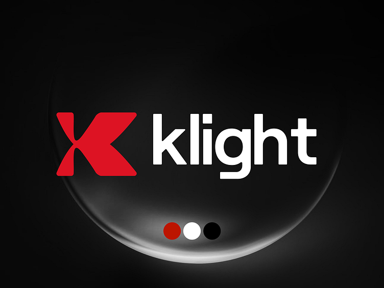
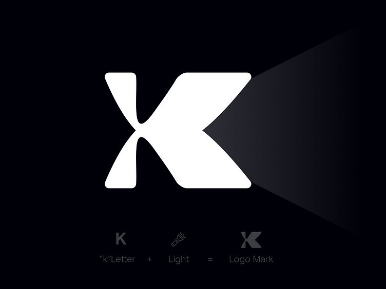
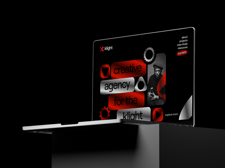
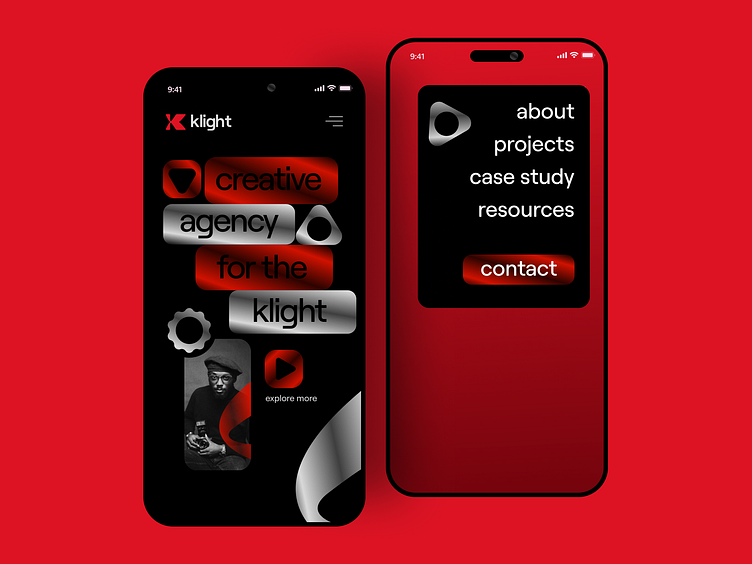
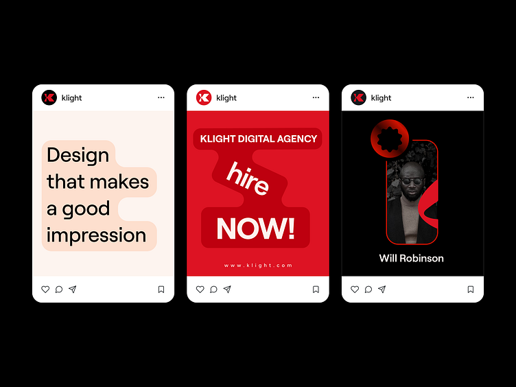
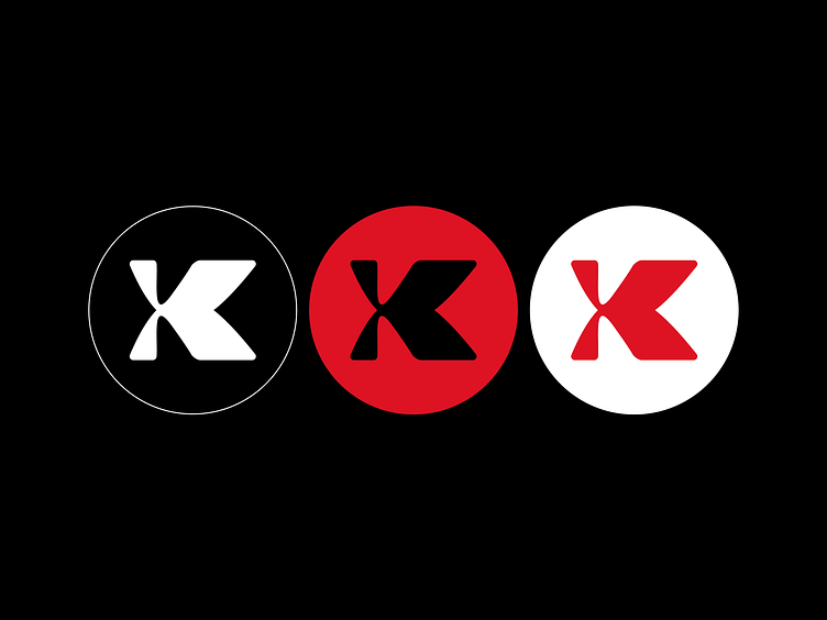
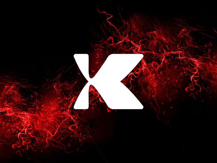
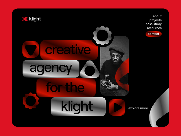
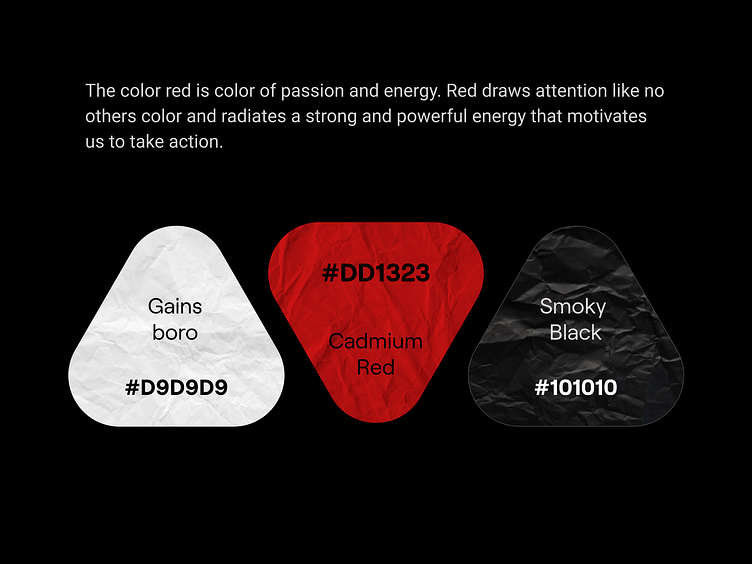
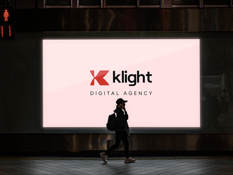
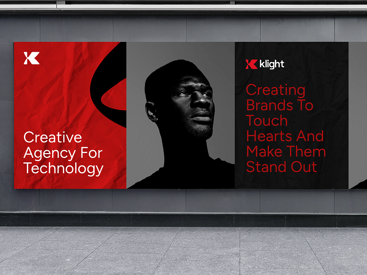
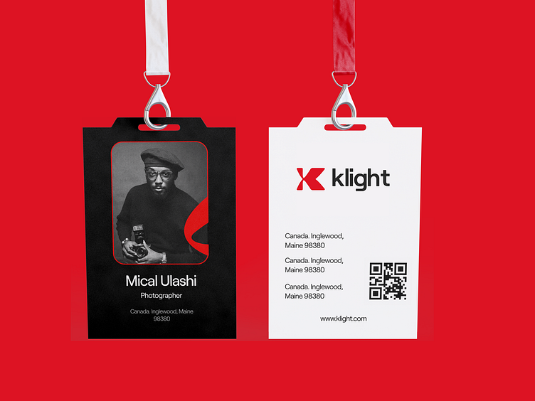
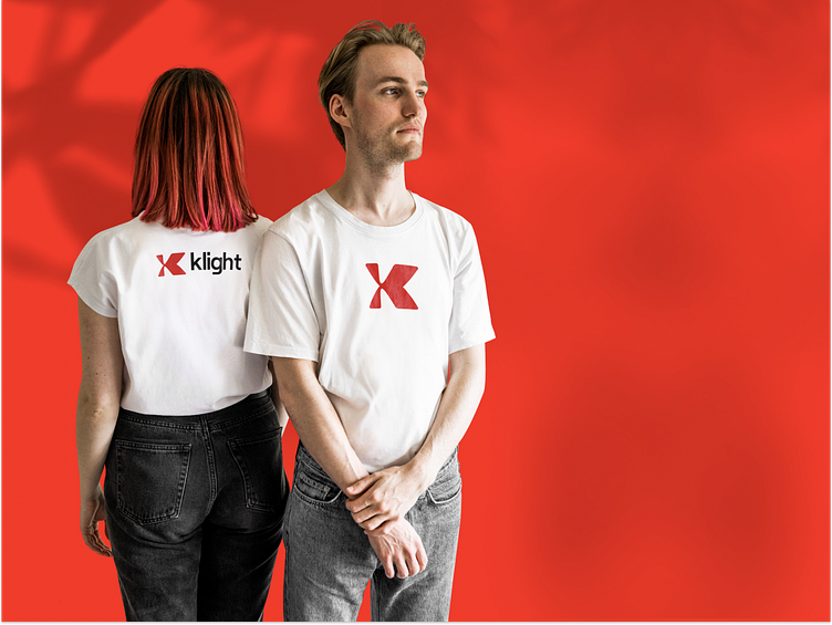
Klight Digital Agency is a technology and business solution integrator that helps businesses simplify their journey by reducing complexity. The logo of Klight is a combination of the letter “K” and the “Light” shape. Here, light shapes represent positivity, clarity, confidence, inspiration, and knowledge. The color red is the color of passion and energy. Red draws attention like no other color and radiates strong and powerful energy that motivates us to take action.


Available for Brand & UI/UX Design
Service and projects
📩 Let’s Chat: aiashik016@gmail.com
📞 Call me: Skype
