Spotify Redesign
Hi fellow designers!
It’s Monday and it’s time to show you some stuff.
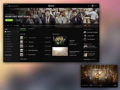
I’ve decided to think about Spotify . it’s not an official design for sure ;)
I use it everyday but some stuff stay bizarre for me .. sometimes i’m playing a song and i can even
know where i am on the right panel. It’s true sometime you are listening like 30 songs and the right side don’t display this one ( see attachment 1.att ) so i think it can be cool to refresh it to show the song your listening in the top part of the right panel.
I liked the idea of having more place by placing the bottom music control bar in the middle as you can (see in attachment 2.att) 1 i always move spotify when i am working in a corner of the screen and cannot more access to control.
Still in My opinion i think that place devoted to music my friend listen is too important 3 are enough if it refresh.
The same for related artist .. In our exemple i can find 5 artist more close to mumford than the 5 proposed by spotify ( i don’t know where they find some similarity sometimes )
Another thing that i think can be cool is to display music videos. When i listen some music i’m always Thinking « live it must be awesome « so i shut spotify to go on youtube and launch a list of videos.
Once again these are just my feeling and some improvement i think useful. I’m not pretending anything, just putting light on some stuff i think perfectible .
Have a nice week !!


