MLHS
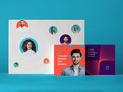
We seek to create an atmosphere to talk about all the company's services in a more conceptual way. The symbol was clean, easy to associate and with a minimalist concept so that it can have greater durability. The whole concept was made with modernity and joviality in mind. The typography followed the shapes and thickness of the symbol in addition to having characteristics that convey all the sensations related to the brand attributes.
More by Dinamite Criativa View profile
Like
