YAV
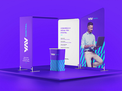
The first step of the solution found for the brand was to create a logo with its own typography. The name YAV was written in capital letters, because that was how the company should be verbally represented, also to convey an idea of grandeur, a striking presence; however, in order for the brand not to be too serious - because it is written in all caps - the glyphs were drawn with a good size of mass, in addition to having some rounded corners in some areas - this guarantees that the brand will be seen as professional, however, at the same time, a company that values proximity to its consumers. In addition, we selected a color palette to add playfulness and creativity to the brand. Finally, we chose a set of typography to represent YAV's modern and technological tone of voice, and graphic patterns that reinforce attributes of creativity, technology, modernity, joviality and professionalism.
