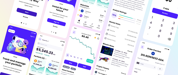
Bitfold Crypto Wallet
Tools: Figma | Duration: Sept. 2022
My Role: Wireframe, UI Design, Prototype and Testing
Bitfold is a crypto wallet app designed to make trading crypto currency more approachable with a easy to understand functionality . Many people who are new to crypto have no experience, and most current apps are bloated, confusing and overwhelm potential traders.
Goal: Create an app that is beginner friendly for users who are not a techie or crypto veteran.
Understand the Users
The crypto market is growing and doesn't seem to be slowing down anytime soon. This is a perfect opportunity to solve the barrier to entry for the everyday new crypto investor. A mobile app is the easiest, most accessible and approachable avenue for adoption.
Thanks to the interviews and surveys with our target demographic, there is a clear understanding of who our target demographic are. To ensure we serve all user comes from a variety of background, we are taking inspiration from simplify investment apps like Robinhood and Cash app which will add some familiarity.
To avoid bias, I take the time to understand the background of our user to better make design centered around their needs.
Wireframing ideas
During the ideation process, I took the time to enhance the pre-existing wireframe and improve it's features. An example of this is selecting the amount and reviewing the order.
Selecting amount UI:
It was not clear what I am buying and the amount of that crypto being received so I added that in along with a switch arrow icon to alternate between the two.
User can now switch between buy/sell and what currency they are using for the purchase. This is to limit the need of having to go back and forth between screens and continue the buying process.
Clear indication that this is a one time buy into the account
Review Order UI:
Add the crypto coin icon to visually let you know what you have selected
Down select icon to "Payment Method" to choose payment type ex: PayPal, Debit/Credit, Third party payment options.
Add Term of Service acknowledgment
Visual Design
During this process, I took the time to figure out what works best in improving the design. The home screen centers around the user's account and interest in contrast to the earlier wireframe that took the user to the marketplace. I went with this approach because it gives the user quick access to their account for a brief summary.


