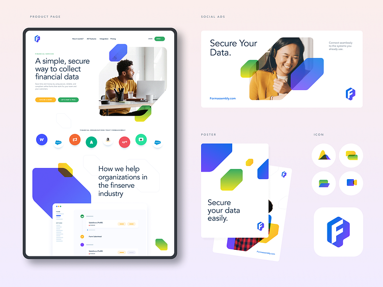
Landing page for a tech startup
Happy Monday everyone!
Today I want to share some additional work we did for FormAssembly.
On the left, you'll find the "solution page".
Like most solution's page, it needed to be easily duplicable and editable. As I mentioned in my other posts, the brand shapes are used to support visuals or create separations between sections while keeping a clean design.
On the right, I share some the iconography style we used on the site, and some of the materials we played with while building the brand.
Voila!
--
Get regular updates of our work
Work Inquiry
👉 hi@studiovoila.com
More by Voila View profile
Like

