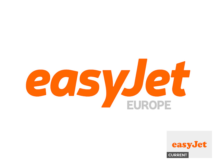
An improved easyJet logo
So, here I am on a Saturday night, feeling creative. I decided to attempt to improve a major brand logo within Europe, which may have not been one of my best ideas, but I thought I’d give it a go nonetheless.
After a little bit of research, I started looking at the easyJet website and thought, why the hell not? And this is what I came up with.
The easyJet logo, along with their website, looks quite dated, especially using Cooper Black as a typeface. I wanted the logo to look new, fresh and to give the impression of a cheap and quick service (hence the italics).
I decided to add ‘EUROPE’ to the logo as one, I felt the logo needed something extra and two if easyJet was to expand into America, Canada or Asia, this could be changed accordingly. No pressure at all, Stelios ;)
As always, any ideas and thoughts will be appreciated.
