Unikube - A platform for Kubernetes development
Unikube automates rolling out Kubernetes environments to your team, installing all necessary tools and dependencies without any Kubernetes knowledge needed.
The Client
Unikube is on a journey to help developers by simplifying the process of running different software projects on their computers!
Founded in Germany, Unikube is a team of young explorers solving people’s problems through their intuitive solutions.
The Challenge
Running a project in a local development environment was becoming quite a hassle for developers.
Unikube needed a platform through which anyone from the organization could access projects and start working immediately without any dependency and could even roll out permissions of projects to their respective team members.
For this purpose, we came on board to help.
Project understanding & our approach:
Since it was a whole new domain for our team to work with. Our team first started to understand the different technical terminologies provided in the project brief.
Moving forward we planned features through card sorting using Figjam and based on that, created a user journey map.
Card sorting
User Journey Map
Ideation & Sketches
Based on the ideations, our team started to create sketches of the flow we were planning to incorporate. For some of the modules where things required technical assistance, our client provided us with content requirements, and by following that we created different variations for screens as well as components.
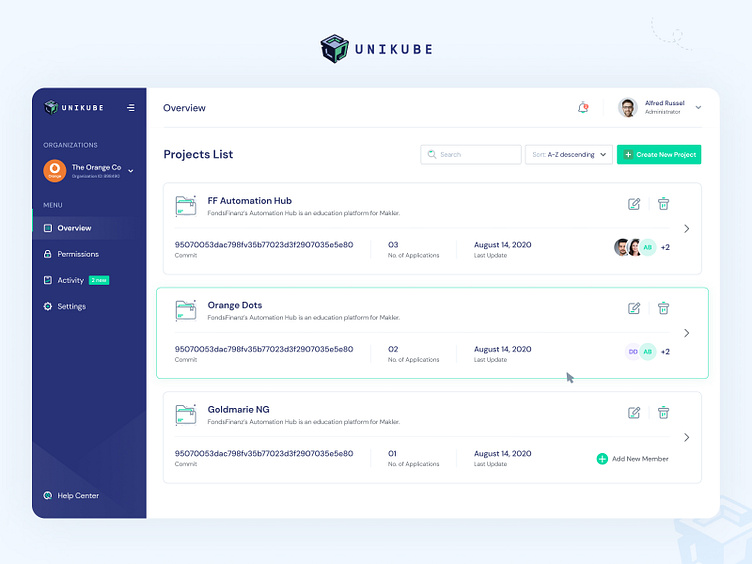
Helping unikube create a new web application.
Ready to be rolled out!
After long ideation carried out through rough sketches and wireframes, our team finally moved towards creating high-fidelity mockups for Unikube and giving life to all the ideations we did!
Scalable and intuitive web platform.
While building the platform we keep in mind that it should be straightforward and easy to understand. We established a consistent design language throughout so the user is always aware of the required actions and thus no confusion is created!
The color system, typography, and icons!
We put in place more colors from the primaries followed by some new typographical styles and clean and catchy icons.
Making it easier for the first-timers!
We added a knowledge-based section to provide some help on how to use the platform so the users know it beforehand!
"They had very talented designers and communicators. They push back if some of our suggestions does not make sense. We really appreciate that"
Managing Director, BlueShoe GmbH
Looking for product design work?
Contact us: hello@decojent.com


