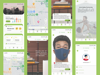
Redesign Air Quality App: Nafas
Hi all, I redesigned this solely for learning purpose. I don't know this applications before my husband told me he just downloaded one. So, it's interesting to recreate something based on what I've learned so far. So here's the changes I made:
1. On the homepage, I edited the navigation bar to make it simple and clear. Also I harmonized the color combination. I added the illustration as background to help users picturing what is it to live in dense city with bad air quality.
2. I changed the icon name from maps to check so that people who uses this app will focus on air quality checking rather than checking the navigation that's related with word 'Maps'.
3. On original version of this app, I find it exhausting to scroll down several times with only with background that made me think this is endless. So why wouldn't I make it simpler by scrolling it horizontally? Only 5 short scrolls to see what's in that page.
4. And I put again the skyline picture on read page. I scrutinized this page that brought me to make it really different since I've got difficulties to find the difference of the content between crumb menus in it. So let's pray in the near future Nafas will collaborate with news portal to spread the awareness about air quality. As seen above, the air quality 101 menu gave all the informations about air quality, the definitions, the trivias and so on.
5. I gave a life for profile menu that I didn't find one on the original app. Previously the menu in this page was pick from hamburger menu on homepage. Also I added the notifications menu in it to make it compact.
So, that's all what I can do to Nafas app. I humbly open for your feedback since I'm still a beginner in designing interface. Thank you!

