B for Bakery - 2
B for Bakery - Part 2
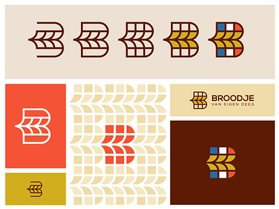
My second concept in this project. Tried to combine the grain with the letter B. The bakery, based in the Netherlands will sell French bread. So I've also included a version with the French colors.
The typography isn't set yet. It's only about the mark at this point.
Looking for feedback on these one. Is there one you prefer from the top?
Name your fav!
1 2 3 4 5
More by Jeroen van Eerden View profile
Services by Jeroen van Eerden
Like

