Redesigning an important page 💸

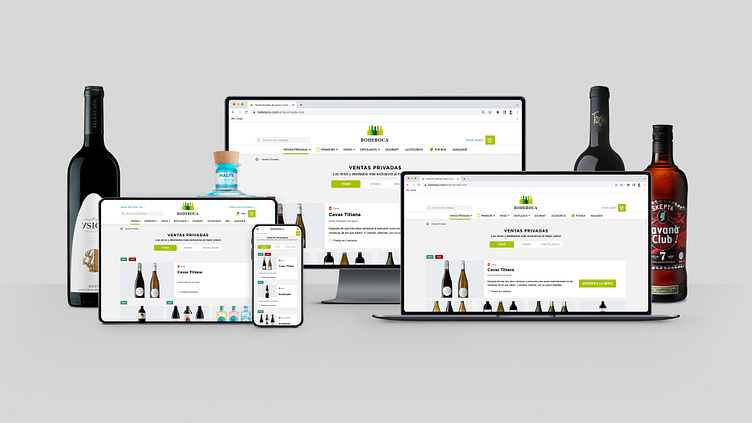
The Private Sales section is the most visited page of Bodeboca. Every day, the team releases selected wine bottles direct from the brand's cellars and spirits with 10-35% discounts exclusively for registered members.
⚡ The problem
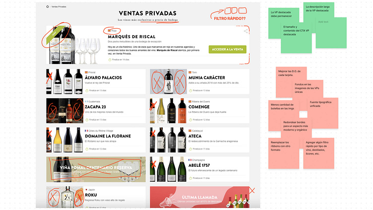
The sales team asked to put more information on the cards, also, I need to fix some spacing issues, and refine the page with a touch of modernity. And this, should be available on responsive screens, before summer 2022 -in 4 weeks.
⚔️ The challenge
Bodeboca has a strong bond with his customers and members, and one of the main keys is that they perceive it as a very soft brand. This is an important thing that I had to keep in mind when I redesigned this interface.
In addition, there was a need to build a teaser-image that could be used on the Drinks&Co website, with different specifications.
✍️ My role
Implicated at: User Research, User Testing, Visual Design
Duration: 4 weeks
Tools: Figma and FigJam
🤔 Analysis
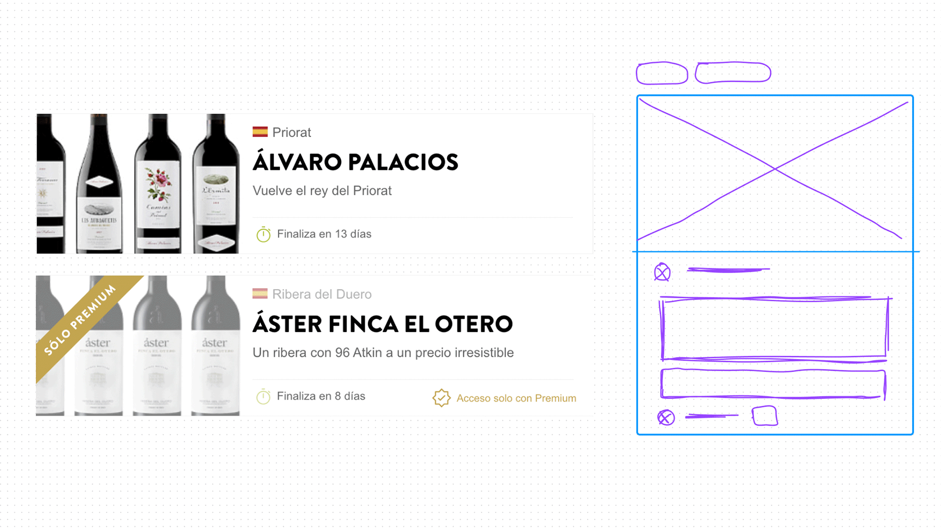
After making a research with the internal client, I found out that the new wall should be cleaner with a more elegant design, and, in order to make it possible, I had to remove certain elements that litter the page.
So, I made a brainstorm with my coworkers looking for things to improve or keep on the next design.
🎯 Focus
After collecting those insights (and several meetings later), I went to the design and prototyping phase focusing on create a friendly way to filter and make cleaner cards for a more aesthetic sales wall.
The wall looks amazing, and the most important thing: It works really good! Go and check it out this work on www.bodeboca.com/venta-privada-vino
What's next?
Hope to update the app soon, to replicate and unify these bunch of improvements applied to the website. Let's see...