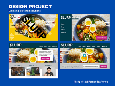
Designlab UX Academy Foundations | Redesign of Slurp II
On this project, I set to improve the hero section of a noodle restaurant website, SLURP. The goal was to analyse its current design and improve its navigation. I started by analysing and noting the key UI elements, as well as any navigation challenges, before sketching a number of solution on paper. I then proceeded to digitise the solutions I had previously sketched in Figma and here is the result. I welcome feedback from the UX community.
See my portfolio | See in Figma | Follow me on... Instagram ⦁ Pinterest ⦁ LinkedIn
More by SFernandezPonce View profile
Like
