CeX unsolicited re-design (WIP)

As a UI/UX Designer and also a gamer, I always had the itch to redesign CeX
This a pet-project that I'm working on outside my work hours. I'm in no way affiliated with CeX, so all of the screens are done based on my experience as a user.
Have a look at CeX website and see what I did different.
CeX is the UK’s biggest online shop for all second-hand tech goodies.
Being a big fan of Nintendo and considering myself a gamer in my free time, CeX is a mandatory stop both online and offline.
This redesign was unsolicited, so it’s strictly based on my experience with the web platform, as a user and a designer. Since I didn’t have access to user data or any research about CeX’s current design, I did my best to come up with solutions that would best suit the common user, without compromising too much the brand and overall feel of the website.
The process
I broke the project into two steps:
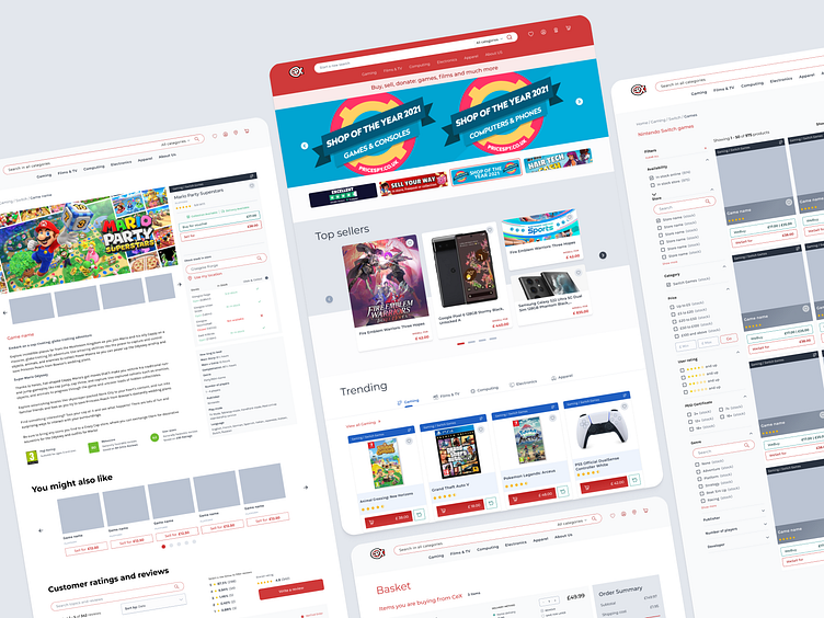
UX Design - Analysis of what the company already does and what should be improved. I created low-key wireframes to better illustrate and organise my ideas, helping me visualise how the screens would look like in the end.
Prototyping a new user interface that would in turn create a better user experience.
UX Design
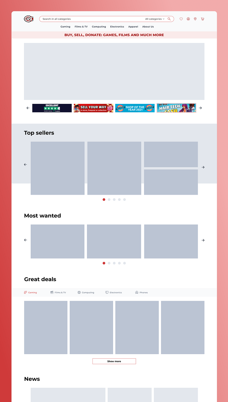
The main offender I found was in the information architecture of the website. One of the biggest issues was the confusing navigation and overload of information on each page.
So far I focused my efforts on creating a cleaner interface, making a few tweaks on the User Experience as well. I based those changes on my experience as a user.
Here is the Figma file where you can have a look at what I have in mind.
UI Design
After spending a few days on the UX side, I turned my focus on the UI aspect of the online shop. Working mainly on the web components, like the product cards.
The UI is fairly incomplete, but here is the Figma file where you can see what I've already done.

