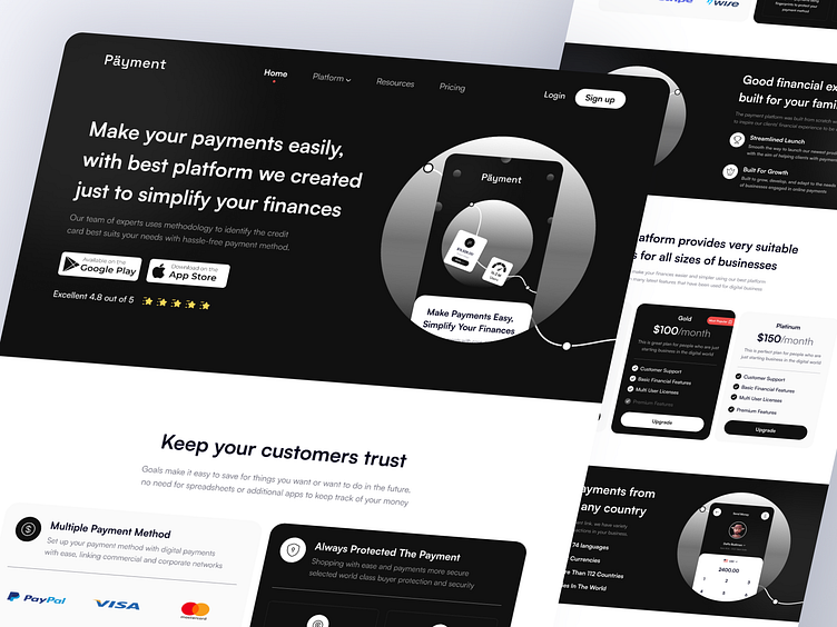
Landing Page - Payment
Hello Dribbble!🏀
Design Exploration for Payment, Currently Payments in all sales stores have changed to online. therefore an application to make payments must exist. we are here to help users feel calm and confident about the flow of money. What could be more important to your virtual cash management than understanding and transparency? This is what we based on the UI of this app. We use a black-and-white color palette because it doesn't distract the user. Accent gradient gives interface modernity. What do you think? 💴
Hope you like it. Cheers! ✨
-
Let me know your Awesome Feedback
Don't forget to Like ❤
Thank you !!
Full Version 🔥
Design Guideline 🚀
Thank you for scrolling🙌
Available for work inquiry :
Let's talk : raffialdo123@gmail.com
- - - - - - - - - -
We are available for a new project, let's collaborate hi@enverstudio.com
Check out our :


