App and Play Store Images
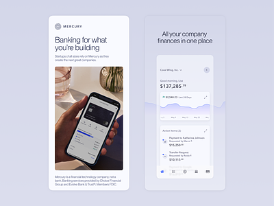
Early September, 2022 was a big time for Mercury. We revealed a credit product that has been in the works for many months, a new fall brand campaign, and a freshly redesigned iOS home tab. I refreshed our App and Play Store screens to fall in line with Mercury's refreshed brand guidelines.
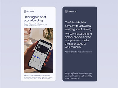
I wanted to create a sequence that felt impactful and interesting. The first screen of the series is a high-level, "who we are" type of screen that can be swapped out with fresh brand campaign images when needed. The next seven screens are slightly fictionalized in-app screens. I wanted to balance showing the features of the app and capturing the vibe of what it's like to use the app. Finally, the last screen is an opportunity to show what we're passionate about as a company – instilling confidence and awe in people using our product.
Overall, this was a very fun departure from the day-to-day product design work and I believe it sets the Mercury apps apart from many of our competitors in the app stores.


