GBS Active
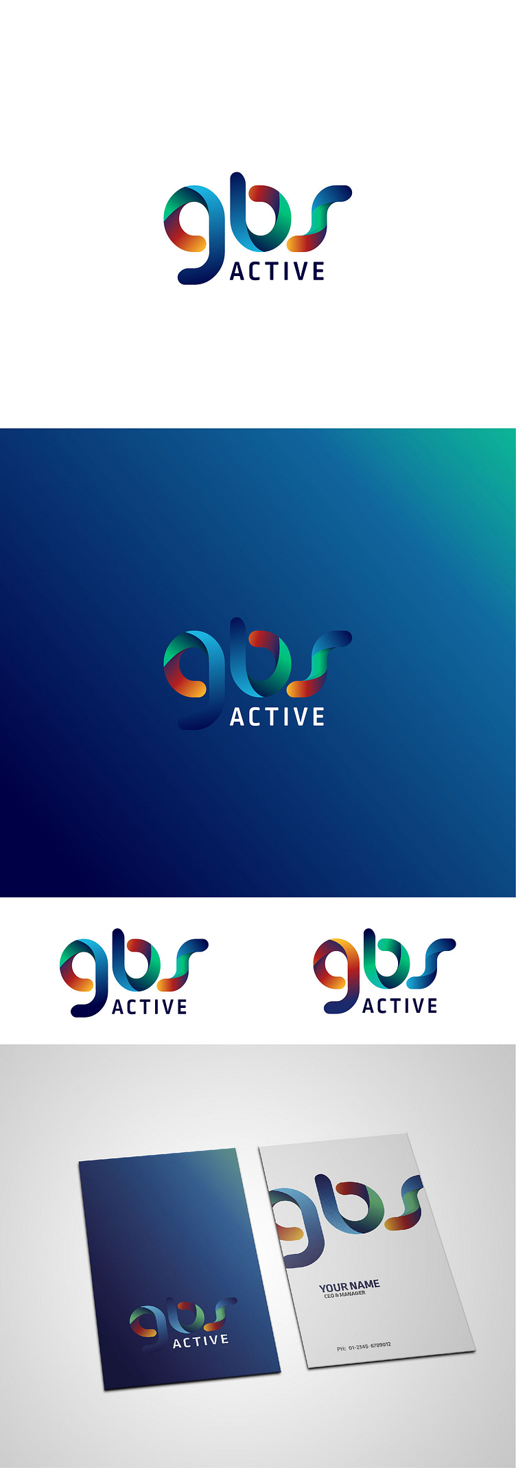
Letter GBS logo design...
A good logo design can make or break a company.
Why?
A logo is the first impression that a potential customer has of a business, and if it is not done right, they'll likely never give the company a second chance.
When we design something, we are constantly considering the message we want to send with our design.
So I set out to design the new GBS logo, We wanted to convey a sense of warmth and approachability.
I wanted my customers to feel like they could trust us and that we were looking out for their best interests.
To do this, I chose a friendly orange-green-blue color for the logo mark, The light, and dark values were carefully chosen to create a sense of depth and dimensionality, while still maintaining a welcoming feeling.
I think the final result is a logo that feels both professional and approachable, which is exactly what we were going for.
And I hope it will help me continue to build trust with our customers as we move forward.
Looking forward to your thoughts.
Are you interested in working with us?
Feel free to reach out via the Dribbble inbox or direct e-mail:
📧 awiabbasi4@gmail.com
