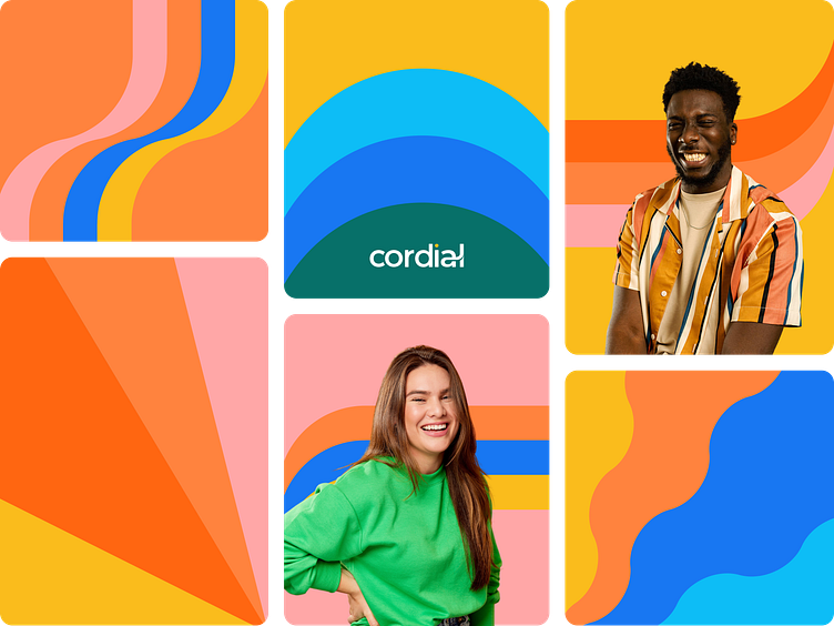
Cordial's Patterns
Send a better message
Cordial helps marketers use all of their data to better connect with customers across email, SMS, and mobile app.As part of the branding process, a set of patterns was imagined to enhance and accompany the Cordial brand universe. These elements that remind of the Californian sunset can live alone or cohabit with photos or text according to the use cases detailed in the brandbook.
Services
The Bruno team created a unique branding that reminds of the brand's Californian roots. Marketing assets and a custom brandmark were designed to convey Cordial’s new branding accross all platforms.
Branding
Art Direction
Brandmark
Marketing assets
Sunrays and waves
The most important rule is the use of the colors in the patterns. First, as on all the communication supports of the brand, Cordial’s yellow must be present in all patterns. Then, 6 color combinations have been designed to ensure consistancy and harmony.Two types of patterns were designed.
Playing with the logo
The patterns use the part of the logo that links the a the to l of Cordial. We have played with the shapes by thickening the a wave, and declining it into 4 colors. We doubled this shape and used the same process to create more patterns: waves, sunrays, and the logo’s dot.
Bruno agency
The Bruno Agency supports clients in their branding projects, website design design of web and mobile applications, as well as in technical maintenance. Our job is to support you in the creation of your identity, your product, your brand. Whether it is a birth or an evolution, we will put our expertise and our creative passion at the service of your project.


