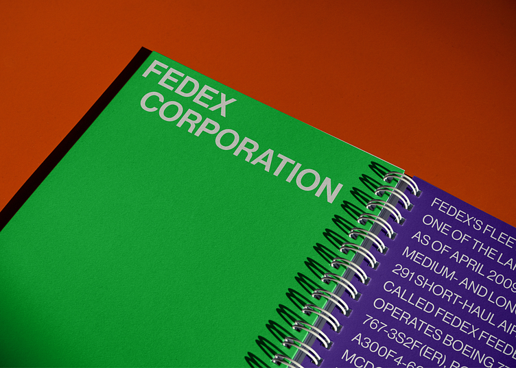
Fedex website design and identity redesign
Hello, Dribbble!
I want to show you my work in which I redesigned the website and changed elements of Fedex's world-famous company's identity.
These are the updated delivery pages. I have structured the information and presented it in a readable way. Now it's easy to find the right information the user is interested in.
I changed the design of the envelope in which packages are delivered. Now it looks easy and stylish.
The home page of the Fedex website.
You should agree that now it looks presentable and arouses interest in the user. In this concept I tried to reflect the long history of the brand and its strength. I used a picture of all the subdivisions to show that Fedex is one big family.
The page about the company.
Here I used the Timeline, so that the user could scroll down the page and see the year in which the story is told.


