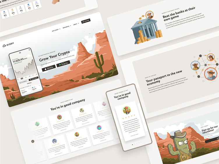
Giddy Home Page
At Giddy, we recently updated our homepage! Cryptocurrency is broadly heard of, but not well understood by most. Once you start talking about the world of DeFi (Decentralized Finance), there's an even greater drop off in knowledge. The goal for this homepage redesign was to tell our potential customers a story that is clear, and educates them on their potential to earn a passive income with Giddy.
My Role
I had the privilege of working closely with our CMO, lead web developer, and our creative team to design and build a prototype for this page. I was responsible for building wireframes with a strong layout and smooth flow. I was also tasked with creating unique illustrations that clearly depicted the content, and helped fortify the story we wanted to tell.
Consistent Visuals with Purpose
The Giddy brand is unique, and it's integral to the voice we wish to have as we speak to our audience. It was important for that brand to be front and center on the home page of our website. From our hero image at the top, to the newsletter sign up at the bottom, we keep color and style consistent. I believe strongly that this helps users stay engaged and feel at ease as they scroll through content.
Additionally, each spot illustration was carefully constructed and animated to represent the corresponding content. Many people only scan copy, but a thoughtful visual can help engage them and fortify the idea we wish to convey.
Working with Constraints
Every project contains special requests, as well as constraints that designers need to work within. For this project, it was really important for us to build something interactive that users could use to see the potential of our product for themselves. Because a large percentage of our visitors browse our website on a mobile device, it was critical that this interactive chart be clear and easy to use on mobile first. Additionally, the chart itself would have been a heavy build for our dev team to build custom. As a result, I needed to work within the constraints of an existing library for this chart, and open communication with our lead developer was very important.
Establishing Trust
Let's be honest. Testimonial sections might be overused. Having said that, they still have value. Especially in cases like ours, where Giddy is not only new, but so is cryptocurrency in general. Many people are hesitant to jump in, and we hope to err on the side of overwhelming customers with positive feelings about what we're trying to help them do. In order to accomplish this, I needed to create a section replete with positive reviews, but also maintained order and cleanliness.
Wrapping Things Up
Giddy is a new company with a fresh brand and a dream to help people take control of their financial future. Designing the homepage was an important task, as it's the first impression many will have with our company. It was important to me that this page was clean, told a clear story, introduced the nuances of our unique brand, and ultimately a page that would lead potential customers to download our app, and start earning a passive income with Giddy!
Special thanks to Trevor Nielsen among others for feedback and collaboration along the way!
Check out the live site here.


