City of Edmond - Hypothetical Rebrand
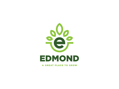
I decided to give my city a hypothetical brand update! The City of Edmond currently has a brand that focuses on an "e" with a realistic tree shape growing out of it (which doesn't really work too well).
So, I decided to give it a facelift! The idea here was to keep the "e" as a focal point, but I "planted" it in the rounded green stroke and gave it some symmetrical leaf shapes, which embodies the tagline, "A Great Place to Grow."
Enjoy!
More by Jeremy Brown View profile
Like


