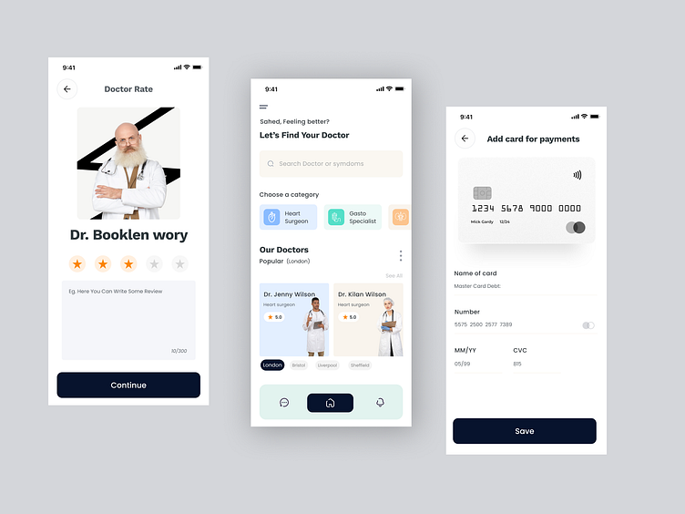
Doctor’s Appointment Booking Mobile App
For Full Views: Behance
Case study: Doctor’s Appointment Booking App
Problem: There are two segments of users: Doctors and Patients. Doctors are not able to extend their help beyond a particular region due to geographical restrictions. Patients, especially in rural areas are not able to receive quality healthcare, face undersupplies of medicines. On the basis of this initial problem statement, I began to dig deep into the topic by starting with User research.
Solution:
1. It supports a high level of readability and quick perception of text-based content, which is crucial for healthcare operations with patient data, especially in cases of emergency;
2. it provides a great field of creating prominent contrast for key interaction elements, such as buttons or icons
3. creates a strong association with the paper on which the data is fixed and in this way sets the pleasant feel of interaction close to typical operations with physical paper documentation, which can be beneficial for people of the older generation, who usually tend to feel better in well-known environmental
4. It adds space and air to the screen which is helpful to avoid the feeling of the screen being overloaded with information and can hinder quick perception of core data fields.
Pain points:
1. Patients find it difficult to find a good doctor or hospital.
2. Patients who are busy with their work find it hard to book an appointment instantly.
3. Need to wait in long queues. Sometimes when they are not able to commute for some reason, they are not able to consult doctors online.
4. Instant video calling and text checkups to a doctor are not available. Patients are not able to search for doctors symptoms-wise.


