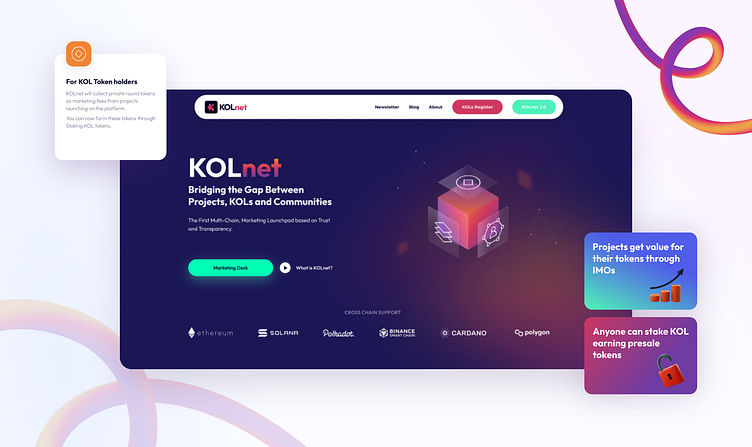
Branding and UI/UX for KOLnet
KOLnet is an innovative, transparent, and fair launchpad that allows early-stage projects to optimize their marketing strategy through the innovation of WEB3 by creating Initial Marketing Offerings.
The goal
We had a mission to create a new logo and website design for KOLnet. Our goal was to make KOLnet look innovative, trustworthy, and a fair brand. Also, it had to be modern because we are talking about WEB3 here!
New solution
For a new KOLnet logo, we chose bright gradient colors to bring some joy into their customers’ minds. Marketing can sometimes be stressful, so we used soft colors to show that this brand will do everything for you!
As an icon, we used a K letter. K has a twist and symbolizes that KOLnet will help you pass a brick wall and bring you to the right path.
Their website is the best place to find out more about KOLnet. We kept it straightforward because first impressions are the most important. We showed their process and how they can help people.
Data
We have completed this project in around 3 months. We had a lot of calls and discussions on how we should approach things and how to make the best versions of the brand.
1 Brand designer, 1 UI/UX designer, and 2 project managers worked on this project. Figma and Adobe Cloud were used to create this project. We had around 15 meetings in total.


