Anya: Product Design
Intro
LatchAid: A mobile app to support parents raise their newborns through early childhood.
Brief
To rebrand and create a collection of concept designs for a soft relaunch and re-release of their product into the App and Play stores.
Proposal
The initial section of the design story below documents the pitch of how we were proposing to redesign the product. We started by defining the core values of what needed to be present in communicating the brand.
Below are references to other brands the client likes aspects of and wanted to include.
Other projects we had worked on creating brands designed specifically for shipping to the App and Play stores.
After winning the work we evaluated what we had learnt so far from the initial workshops.
The first round of logos was very conservative as the client's internal team was very nervous about the rebrand, so we didn't steer too far away from the original trying to retain as much as possible.
The first round of conservative logo concepts focusing on the values; empathy, and post natal support.
The first round of logos were considered not radical enough, the whole team was now on board with the product rebrand so we stretched our legs and went in a more 'techy' direction.
The client decided on the below for their new logo which became the foundation to build the concepts and style guide on.
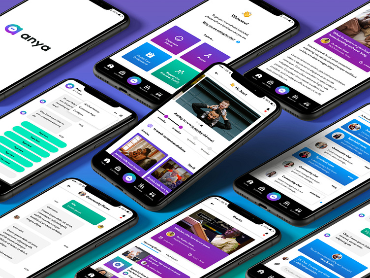
Screen designs painting the existing product with the new brand identity: Logo, assets and UI components.
Final product concepts showcasing the new brand.
Checkout the finished branding out in the wild below...


