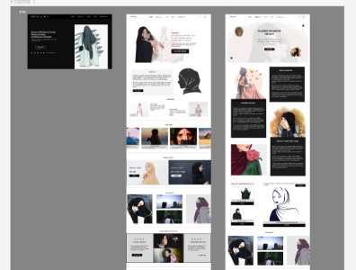
Heryert Cloth Store Website Design
This is modest cloth store web design, showing the landing page, the homepage and the about us page. The design is made to depict all of what the store has to offer. It was interesting working on this as it involves using just neutral colors, yet making it look attractive to the sight. UX research was done as to what cloth stores website looks like, broadening UX research knowledge.
More by Ameerah Sanni View profile
Like
