Beech-Real Estate Branding
Hello guys, 🤩
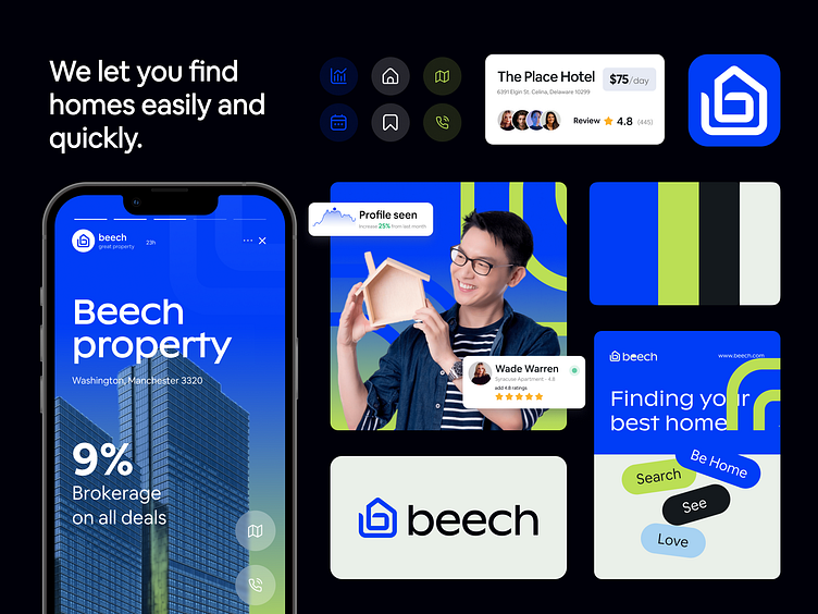
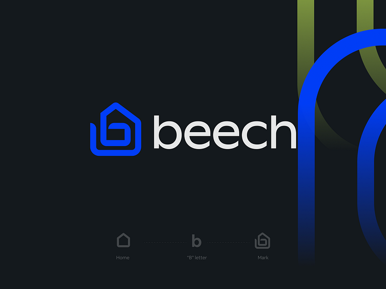
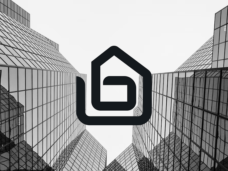
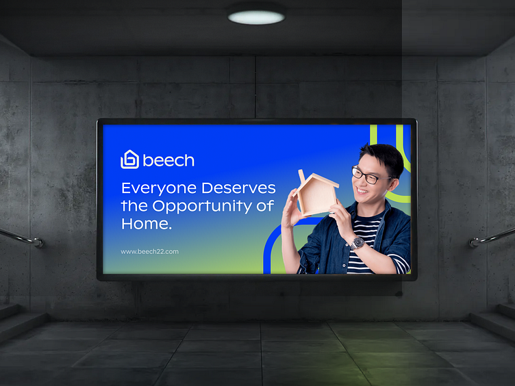
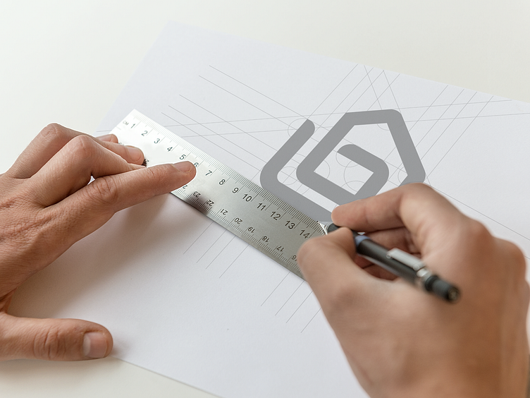
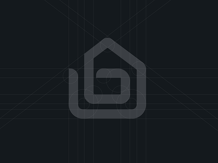
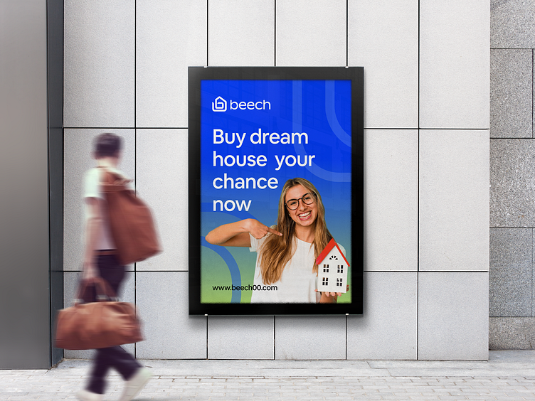
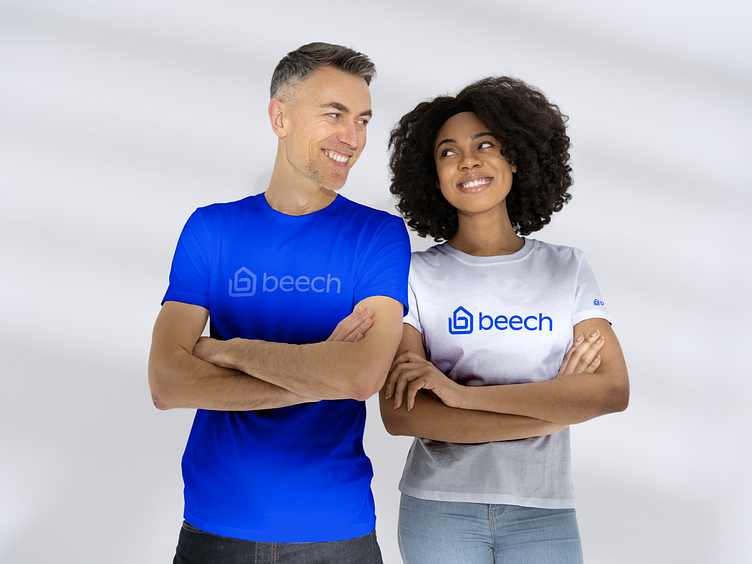
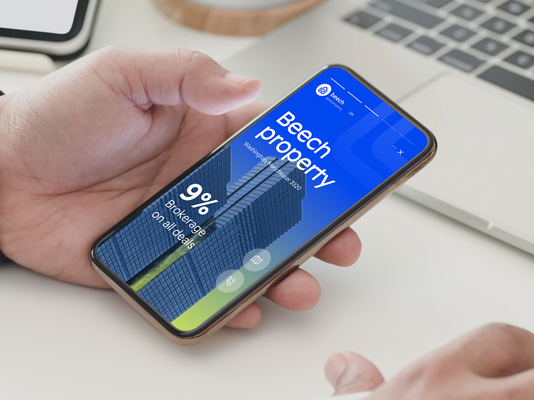
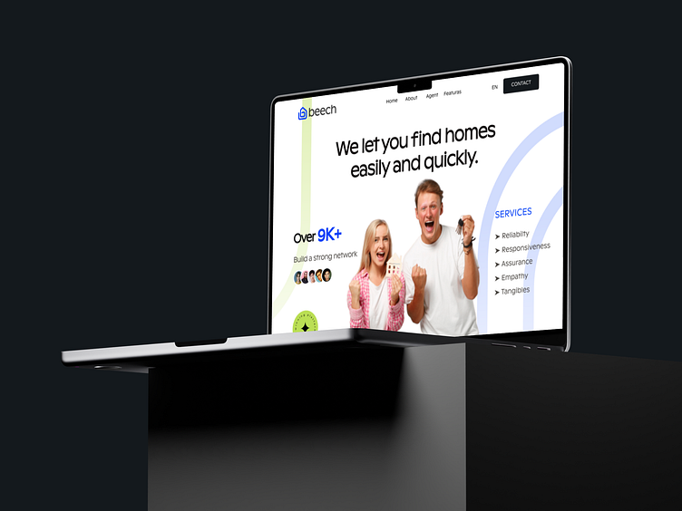
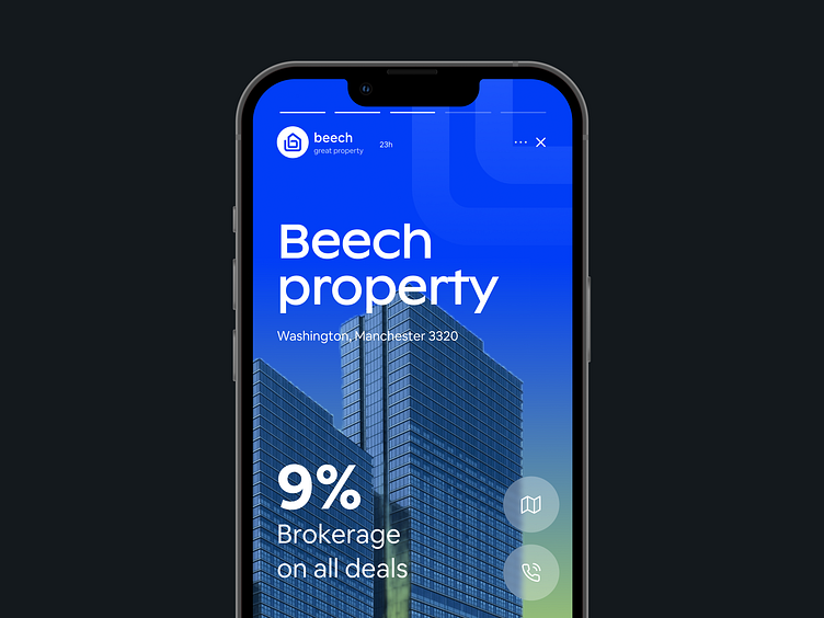
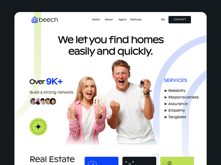
The Beech logo is done for the real estate industry. The idea of beech is to make buying and selling property an easy and headache-free job. When someone want to sell a property it’s just a few step ahead with beech. All they have to do is fill in some information and list the property there and the rest of work will be taken care of by Beech. On the contrary, when someone wants to buy a property they can choose from thousands of options given by beech. Beech builds out of trust, so I used blue color which is the symbol of trust and peace.
I'm available for freelance hire, part-time position (Remote) and Project basis
📩 Let’s Chat : aiashik016@gmail.com
📞 Call me: Skype
⭐️⭐️⭐️⭐️⭐️ 5-star rating profile on GrabStar

Available for Brand & UI/UX Design
Service and projects
📩 Let’s Chat: aiashik016@gmail.com
📞 Call me: Skype
