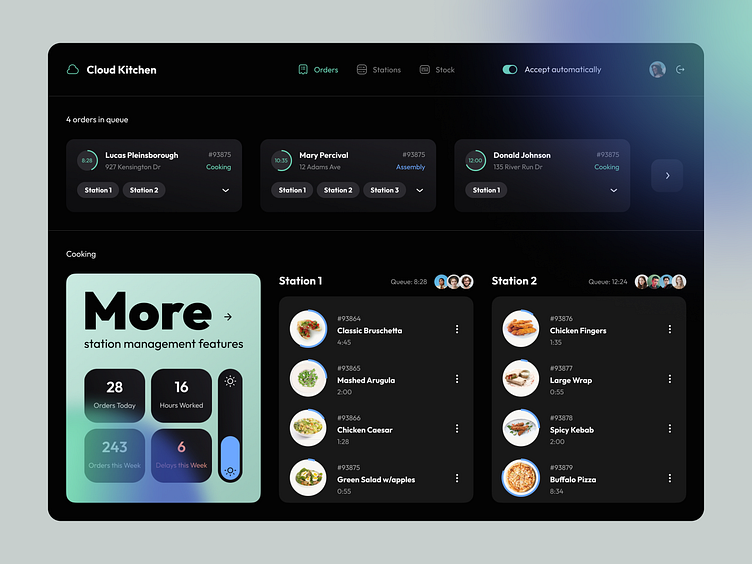
Cloud Kitchen: Kitchen interface
💌 Have a project idea? We are available for new projects!
hello@ronasit.com | Telegram | WhatsApp | Website
Restaurant management software has been evolving rapidly during the last few decades. Each day new systems pop up, and they all become more advanced and precise than their forerunners. Today we’d like to present to you our vision of restaurant management software.
The page displays the list of orders and the main information about them. Below there is a banner that tells the user about extra features that can be bought. Also, there is a list of dishes for each station.
This is a dark mode of the application that would be convenient to use at any time of the day and night. Also, we added light blue accents that stand out against the background of vivid dish photos.
Managing the workflow of the kitchen staff has never been an easy task, so we tried to make this interface clean and well-structured. The information displayed on the page is divided into blocks, so it is easy to perceive.


