Font Design
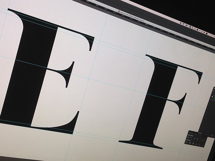
I've been working on developing a custom high-contrast font for a client over the last few days. They're looking for a fashionable, modern font that will look good against black and white photography.
This is still very much a WIP, but here are the E and F (I know, they're effectively the same letter).
I'd love your feedback on how they're coming along.
Also, designing fonts is hard.
More by Jeffrey Jorgensen View profile
Like
