Website Design | Grounds Donut House
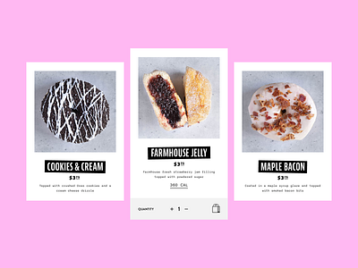
Web design and typography elements for Grounds Donut House. The intended vibe for their company was a "cali, punk rock feel" so I wanted to merge the luxe of California, with the grittiness of punk into the typography.
🔗 Check out my full case study on Behance.
More by Amanda Edwards View profile
Like
