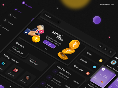
PhonePe Dashboard - FinTech UI 💸
Hello again! Today, we bring to you a FinTech dashboard concept. PhonePe is a payments mobile app that meets all your payment, investment, mutual funds, insurance and banking needs. Here's a look at how you can use your web to access a more refined FinTech experience.
Colors:
#6739B7 - #9A7EC9 - Primary gradient for cards
#6739B7 - Primary brand color
#E5C453 - Secondary yellow
#E57255 - Secondary orange
#46BDDF - Secondary blue
#121212 - Black 1 used as dark theme base
#1A1A1A - Black 2 used as contrast to dark theme
#FCFCFC - White 1 used for prominent headings
#F5F5F5 - White 2 used for subheadings and body copy
#52D273 - Positive state
#E95065 - Negative state
Font:
Uni Neue (Bold) - used as PhonePe's branding for headings
Uni Neue (Regular) - used as PhonePe's branding for body text
Asset Link or credits:
3D illustrations are shared from Iconscout
Icons are from Iconly
Techniques:
Linear Gradients
Glassmorphism
Isometric design
Skew planes
3D mockups
Elevated UI
Dark mode
Our designer says:
“I love experimenting with design. Be it in terms of interface or technique. Finances are important to us, thus handling them from a screen as small as a mobile can be challenging. This little thought ignited an idea - What if PhonePe has a web dashboard? Studying and researching on how I can implement the brand guidelines into an entirely new platform resulted in this design. Hope you like it."
Feel free to give me some feedback.
And don't forget to press "L" if you love it. ❤️
--------------------------------------------------------------
Download File Here
--------------------------------------------------------------
Have an idea? Let's talk here or WhatsApp
Follow us here:


