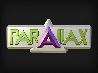
Parallax Logo Update
After spending most of last semester working on modeling assets, I've finally started my official texture pass. As a test of my modular texture system, and because we really needed it, I updated the Parallax logo with new materials that better fit the style and quality of the finished assets. This version of the logo, besides being brighter and having better contrast, is also less grungy looking with more subtlety in its wear patterns.
----------
Of course, not long after creating this we discovered that the name "Parallax" was already in use and, rather than encounter a naming conflict, we opted to change the name of the game to Dichotomy.
More by Alex Berkowitz View profile
Like
